Whether you’re creating your first logo, editing an existing logo, or totally redesigning an outdated logo for your business, you’ve been tasked with representing your brand and everything it stands for within a small graphic icon. A logo design project requires extensive knowledge of what your business stands for, what your current competitors are doing, and how design principles can be applied to capture attention and promote memorability. To increase the likelihood of a successful logo design, many companies turn to digital agencies like Bluetext who understand the competitive landscape and get to know each business in depth before designing a logo that accurately reflects the company and helps them stand out among the competition. The following 4 principles are integral considerations for the logo designing process at Bluetext, and they should be utilized by any company looking to create a timeless, impactful visual identity for their brand.
1. Color
More often than not, color lays the foundation of a brand. Color is the first thing that catches the eye, and in an age of diminishing attention and quick digital scans can make or break a strong brand. With the power to improve brand awareness by more than 75%, color psychology is an essential consideration. Digital marketing & branding agencies advise considering the perspectives of two important players: the end-user and the industry. Below are three critical questions to ponder before any branding objective:
- How do you want to be perceived by these audiences?
- What emotions should your brand evoke from end-users?
- How do I want to compare to industry standards? ‘Zig’ (run with the pack) or ‘zag’ (go against the grain)?
Certain colors tend to dominate different industries. Ever wonder why almost all fast food brand logos use the colors red and yellow? Red elicits passion and energy, while yellow stimulates hunger, which leads to subconscious food cravings. In comparison, the government contracting industry tends to use the colors red, white, and blue to invoke a sense of patriotism. Understanding the emotional impact behind your color choices can help your brand resonate with users and prospects. However, while some colors are tried and true, you should also weigh the costs and benefits of choosing the colors commonly found within your industry. Your ultimate goal should be to stand out amongst the competition, rather than blending into it. Whether or not color palette is the avenue to differentiate is a question that an expert brand agency would be able to consult on. While it may be tempting to utilize numerous color combinations, within your brand and logo, keep in mind the second most important quality of a logo: keeping it simple.
2. Simplicity
Visuals can communicate information 60 thousand times faster than text, a simple visual can be more impactful—and memorable—than a complicated or wordy design. Especially with the rise of mobile users and smaller screens, reducibility is a critical factor. Your logo should be comprehensible across multiple sizes—from a banner ad to a website favicon. Complex, detailed logos often have legibility challenges on small devices, therefore limiting your opportunities to show off even the most stunning designs. When there are too many competing elements of a logo, a viewer’s attention is divided between them, which detracts from their ability to recall the logo as a whole. It’s much more effective to choose just a few key elements of your logo to highlight your brand offerings. A good logo communicates your company’s strengths, whether it’s a rich history, creative thinking, or literal products featured in the design. The devil is in the details, which is why leading brand agencies advise a simple, yet scenic, route to logo success.
3. Adaptability
Another important aspect of your logo is that it must hold up to the test of time. A brand as a whole can be updated and refreshed every now and then, but replacing an outdated logo can be a large undertaking. A timeless logo is one that can be implemented across different formats, from horizontal, vertical, square, black and white, full color, etc. These format variations allow the same logo to be adapted to different contexts as the opportunity arises, whether that be print materials, branded merchandise, and new online formats. Anticipating new ways to use your logo will keep users engaged with your brand as you expand across different platforms. Your brand’s style guide is an important resource for explaining how your logo and brand identity can be communicated through different channels.
4. Relevance
The previous 3 qualities of your logo tie into one overarching factor: relevance. Before considering a logo redesign, you should talk extensively with target consumers to better understand how they perceive your current logo and overall brand. Creating a logo that reflects your brand identity is one thing—making sure that customers actually receive and understand your message and the brand behind your logo is an entirely different challenge. A digital marketing agency can be a powerful partner to compiling market research and getting a third-party perspective on your logo’s effectiveness. To learn more about how to stay in tune with your customers to make sure your branding conveys the value you actually offer, check out an interview with Bluetext’s Jason Siegel and Travelocity’s Terry Jones on avoiding brand regret.
Keeping up-to-date with design trends is one way of reading the market at a broad level to see which logo design techniques are resonating with audiences. However, accurately representing your brand is more important than being trendy. In the cyber-security space, for example, the challenge of selling an abstract concept has led many companies into the trap of using stereotypical imagery or design to try to communicate that they work with computers, coding, and hackers in hoodies. However, following those trends has led many companies to fall into the clutter of the category—a space where they’re practically indistinguishable from competitors. In order to avoid these common mistakes and stand out as strong competitors within your industry, consult a brand & marketing agency for your logo design.
Contact Bluetext to take the first step in setting your brand (& logo) up for long-term success.
In our recent blog post, we discussed the power of strategic branding in the world of private equity. As we mentioned, the first step in developing a new brand for an M&A should be to gain understanding and consensus on how you want to be (and can/should be) positioned within the market via your company messaging and positioning. Once you have the words right, it’s time to get the looks down. Your company CVI (corporate visual identity) includes the logo, the color palette, typography, graphics and iconography, unique branded elements like an image masking or pattern overlay, and so much more. As we stated before, you only get to go to market with your new brand once – make sure it counts by following our steps to a successful M&A brand launch below.
3. Define the New Company Structure
When merging multiple companies, it’s important to think through the new structure, from multiple points of view – the employees’ roles, the products/services/capabilities, the customers and partner channels, the company values and culture, just to name a few. Understanding and clearly communicating how everything will fit together will help employees adapt to the change and ultimately help the brand strength. Ideally, you should already be thinking about this during the messaging and positioning phase and should have an idea of what’s overlapping, what’re the new capabilities that need to be accounted for, and write new content for? How do they fit into the company story and how do you market them? How does this affect the website’s sitemap, content, and user journey? How does this affect current and new contracts?

Understanding the company’s new structure and thinking about new processes early on makes it easier to design around the new information architecture, flag problem areas that employees or customers might be confused about, and address them before it becomes a challenge. It’s also beneficial to look ahead – many times during an M&A, companies might be in the process of acquiring another new company/companies towards the end of when they’re launching the new brand. Accounting for that potential while thinking about the new company structure and information architecture encourages a scalable structure knowing that the company’s solutions and capabilities will likely continue to expand throughout the process of building the new brand.
4. Plan Your Internal & External Go-To-Market Campaign
Now that you have strategic messaging and positioning, a new corporate visual identity, and a good understanding of new company architecture, it’s time to start planning the launches – both internal and external go-to-market campaigns.
Employees are brand ambassadors, so set them up for success with a smooth internal launch by setting expectations and communicating in a clear way how this change will affect their roles/responsibilities, the culture/values, etc. Employees are looking to understand what this change means for them. How is their job changing, what’s the new org chart, who do they report to, how do they refer to the brand, etc? A personal touch like a letter or video from the CEO can go a long way in delivering a level of unity and excitement about the upcoming changes. Prep them with swag bags of new branded merchandise, prepare a digital brand assets package with all new branded collateral templates like pitch decks/presentations, datasheets, white papers, business cards/stationery, email signatures, brand guidelines on how to use and apply the new branding, etc. A well synced internal launch promotes confidence about the new company and its opportunities, and the employees are an extension of the brand, so preparing them and motivating them for the changes to come are necessary for the brand to hold strong internally before launching externally. The better you communicate to and prepare employees, the stronger the brand will be represented through them.
A compelling Go-To-Market campaign is essential for an external brand launch. This includes everything from PR and media outreach, to ensuring the website is ready to launch, to a strategic paid social campaign with PPC, hyper-targeted ads, geofencing, marketing automation with email campaigns, optimized SEO, and maybe even a brand launch or brand essence video to really stand out and help tell your story.
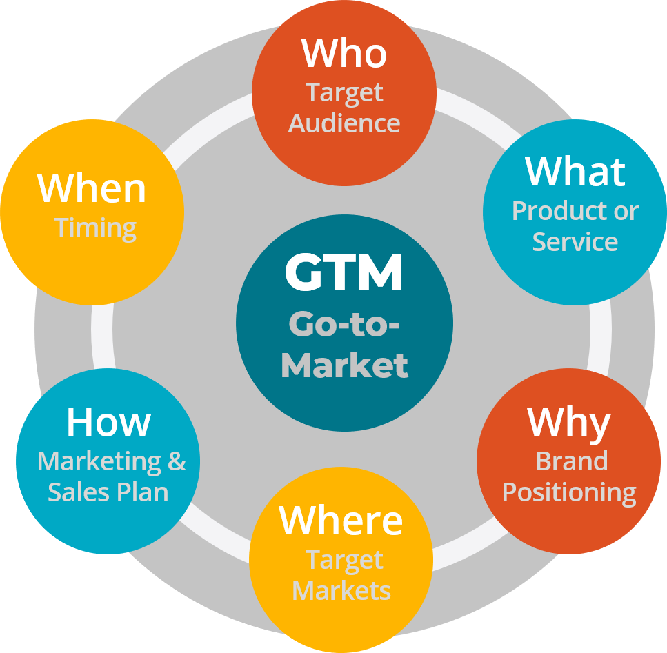
The GTM campaign is where everything comes together – the messaging and positioning weaved in the campaign theme, the compelling visuals representing the new corporate visual identity, and the excitement around the new company’s capabilities and what this means for customers. Executing on a strong go-to-market campaign is not only critical in getting brand awareness, but also in driving home the value of being stronger together – both internally and externally. It’s not about the change; it’s about what’s next, together.
Case Study: SpaceIQ
Enter three leading brands of the workplace management industry: SiQ, Archibus, and Serraview. Each with a rich product portfolio with distinct features, designed for the needs of different sized companies. United, they offer integrated workplace solutions that optimize the workspace and enhance employee experience for companies of any size. Project Union became the name of this powerful merger of three companies into SpaceIQ, a comprehensive solution on a mission to make the workplace good for business and great for people.
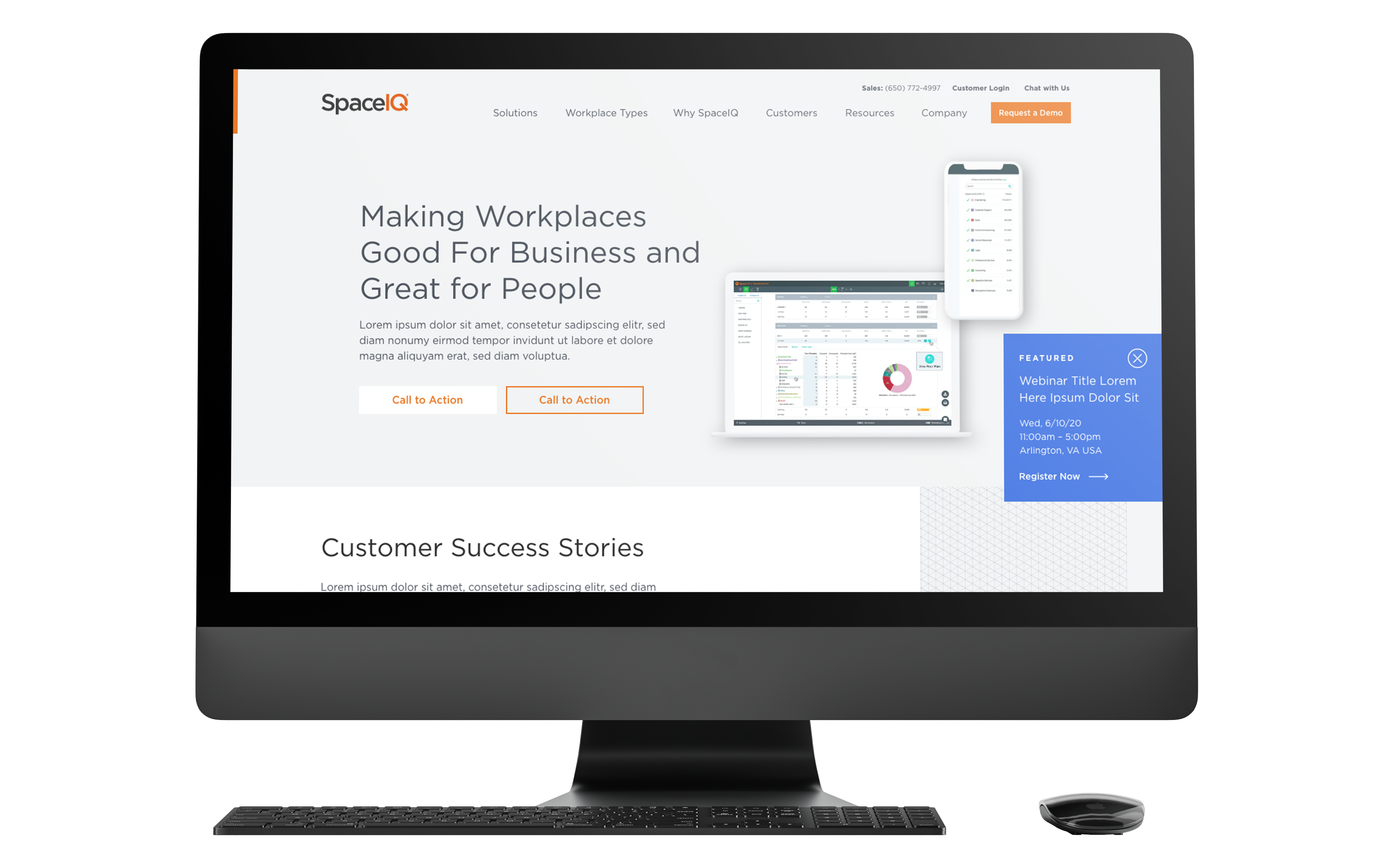
To solidify the merger, SpaceIQ needed a new website that spoke to its breadth of offerings and united company mission. The company turned to Bluetext to turn their new branding into a fully responsive and intuitive website to communicate all of their product lines. The new site was designed with the end customer needs top of mind. Using dynamic components to showcase success stories, custom glossary pages, and a robust resource center for all post types, SpaceIQ customers can easily find all the educational resources they need. The three legacy brands’ relevant products are clearly identifiable through the sitemap and component features, but balanced by cohesive branding and streamlined user journey.
5. Keep It All Going
Finally, keep the momentum going, and even ramp it up! The early stages of launching a new brand from multiple companies require a lot of time, energy, and effort to maintain the excitement and continue to push brand awareness. Also from a technical perspective, there are things to consider like not immediately redirecting all legacy websites to the new site since a lot of content, like contract vehicles, for example, needs to still be accessed. However, it should still be obvious that it’s now a new company – so adding homepage banners on legacy sites with the brand launch announcement, or updating logos on the legacy LinkedIn pages (but not removing them), can help make the transition easier for customers until the brand has had time to fully establish itself in the market and stand on its own. SEO is another area that requires some time and love to see improvement since it’s likely a new name and some new search term combinations that google is processing.
A company is only as strong as its talent, so maintaining and recruiting top talent should be a priority. Consider starting a series of video vignettes with current employees speaking about their time at the legacy companies and how it’s been at the new company. Why do they love it, what makes this company different from competitors, how are there more opportunities now, etc.
Along with recruiting campaigns, continuing to execute strategic brand-awareness campaigns via paid and organic social, continuous content writing for SEO and thought leadership, etc. is a long-term game that’s critical in moving from brand awareness into more specialized branded experiences that will resonate even more with the market.
The stronger the M&A brand launch is, the easier it is for PE firms to sell
The most important thing to address in an M&A brand creation is the why (aka, the value prop) behind the new brand and set clear expectations of what this means for employees and ultimately the market. What new, innovative outcomes can we enable? Prove the value proposition of being better together. If you can get the employees and your target audience on board with the new mission, it becomes less about corporate changes and transactions and more about the new opportunities that arise from being part of this new market-dominating company. And when the portfolio companies succeed, the PE firms succeed. For PE firms, having a strong brand itself, as well as a portfolio of strong brands, is crucial for deal sourcing, fundraising, and ultimately achieving higher investment returns.
A brand is often considered a company’s most valuable asset – make sure it’s in the right hands.
If you’re looking for expert strategy and implementation for your next M&A brand launch, you’re at the right place with Bluetext. We know a thing or two about M&As. 40 of our clients have been acquired within 24 months of an engagement with Bluetext. See some examples of our work with these M&As here, and contact us to get started.
PE firms need portfolio companies with strong branding
Private Equity (PE) continues to be the preferred growth financing mechanism for most “for-profit” businesses. According to McKinsey’s 2019 Market Annual Review, “global private equity valuation has grown more than sevenfold since 2002” – more than twice the growth of publicly held equity valuation. While PE fundraising declined in 2020 to the Covid Pandemic, PE markets are experiencing a strong increase in 2021.
PE firms make most of their profits by acquiring companies, helping management increase Enterprise Value through various strategies, and then selling these companies at a much higher value. Value is quantified using metrics such as Earnings (typically EBITDA – Earnings Before Interest Taxes Debt and Amortization), Earnings Multiple (a factor applied to EBITDA to determine Enterprise Value), and valuation of Intellectual Property.

A common and highly effective growth strategy for PE portfolio companies is buying competitive or complementary companies through Mergers and Acquisitions (M&A). The brand is almost always a key component of a) the Earnings Multiple and Intellectual Property Value metrics in the valuation process and b) a successful M&A strategy. Here’s why.
Branding is so much more than a name and a logo; it’s a representation of how your company is perceived – more specifically, how your customers and the market perceive you. It’s a gut reaction, a feeling. This is why it’s critical prior to going through an M&A to create a strategic, memorable, and unique brand that provides a consistent experience across all channels, and makes sense to not just the market, but to all employees, as they become brand ambassadors themselves. PE firms have many tools and metrics to measure the value of a brand (brand loyalty, recognition, and impact) which drive a monetary valuation.

Sloppy, outdated, or inconsistent branding can make employees and the market feel uneasy and unconfident with the new company. A powerful, cohesive brand right from the gate is essential in sending the right message of being “stronger together.” In addition to looking the part, strong brands are more profitable, grow faster, and sell more frequently. You only get to go-to-market with your new brand once – make sure it counts by following our steps to a successful M&A brand launch below.
Our steps to a successful M&A brand launch
1. Develop New Positioning & Messaging
A strong brand is designed to dominate the market, which is why the first step in developing a new brand for an M&A should be to gain understanding and consensus on how you want to be (and can/should be) positioned within the market. You need to understand where you could be within the market as this new company with more talent and more vast capabilities. Determine how all the current brands’ are currently perceived, vs. how you want to be perceived. What are the brands’ value propositions and how will they be combined? If possible, involve your target audience via surveys or workshops to understand how the companies are perceived. That knowledge is a baseline on how all the companies are perceived in the market today and what needs to change in order to be perceived differently and help set expectations.
Once those baselines are understood, you’ll want to define a specific positioning strategy then base your new messaging off of that. With combined capabilities and potentially different focus areas, the positioning strategy likely will shift, so you need to identify how it should shift and define clear and compelling differentiators early on that the positioning and messaging are based on.
Market your new capabilities, but don’t become a generalist. By combining two (or frequently, more) companies together, it’s obvious there’s more diversity and broader capabilities, but if not done the right way, growing this list can make you seem too generic or disjointed. You don’t want to come across as a “jack of all trades”, but rather, a “specialist of many.” This is why considering not just the increased amount of advanced capabilities, but the outcomes of those capabilities and communicating that clearly and effectively in the new messaging is critical.
2. Create New Corporate Visual Identity
This is what most people think of when they hear “brand”. Corporate Visual Identity, CVI, is how a company visually portrays itself to the public. The logo, the color palette, typography, graphics and iconography, unique branded elements like an image masking or pattern overlay, etc. all work together to form the CVI.
Merging a brand portfolio is challenging, and there are several factors to consider before creating a new CVI. If you’re not going in the “house of brands” direction where the parent company is not associated with the products, then you’ll want to develop a unified CVI that is unique in the competitive landscape, is compelling and memorable, and visually represents the story you want to tell from the messaging. Some questions to consider include:
- How do customers/the market connect with each of the brands?
- What is the brand equity of the company or companies in consideration?
- How will you decide which assets, if any, to retain from each brand impact projected revenue?
- What story are we trying to convey and how can we visually portray that?
M&As set many new paths for success, but if the new company’s Corporate Visual Identity is not unified, meaningful, and applied in a cohesive, creative, and consistent manner, it creates a weak brand without solidarity and won’t have the impact it should.
Case Study: BlueHalo
When Arlington Capital Partners acquired several top-performing companies in national security, the AEgis team looked to Bluetext to help merge multiple companies together to create one superior brand, BlueHalo. Bluetext worked closely with AEgis to develop the new name, logo, messaging and positioning, corporate visual identity brand system, website re-design and development, video work, and a go-to-market strategy and launch plan, and in record-breaking time.
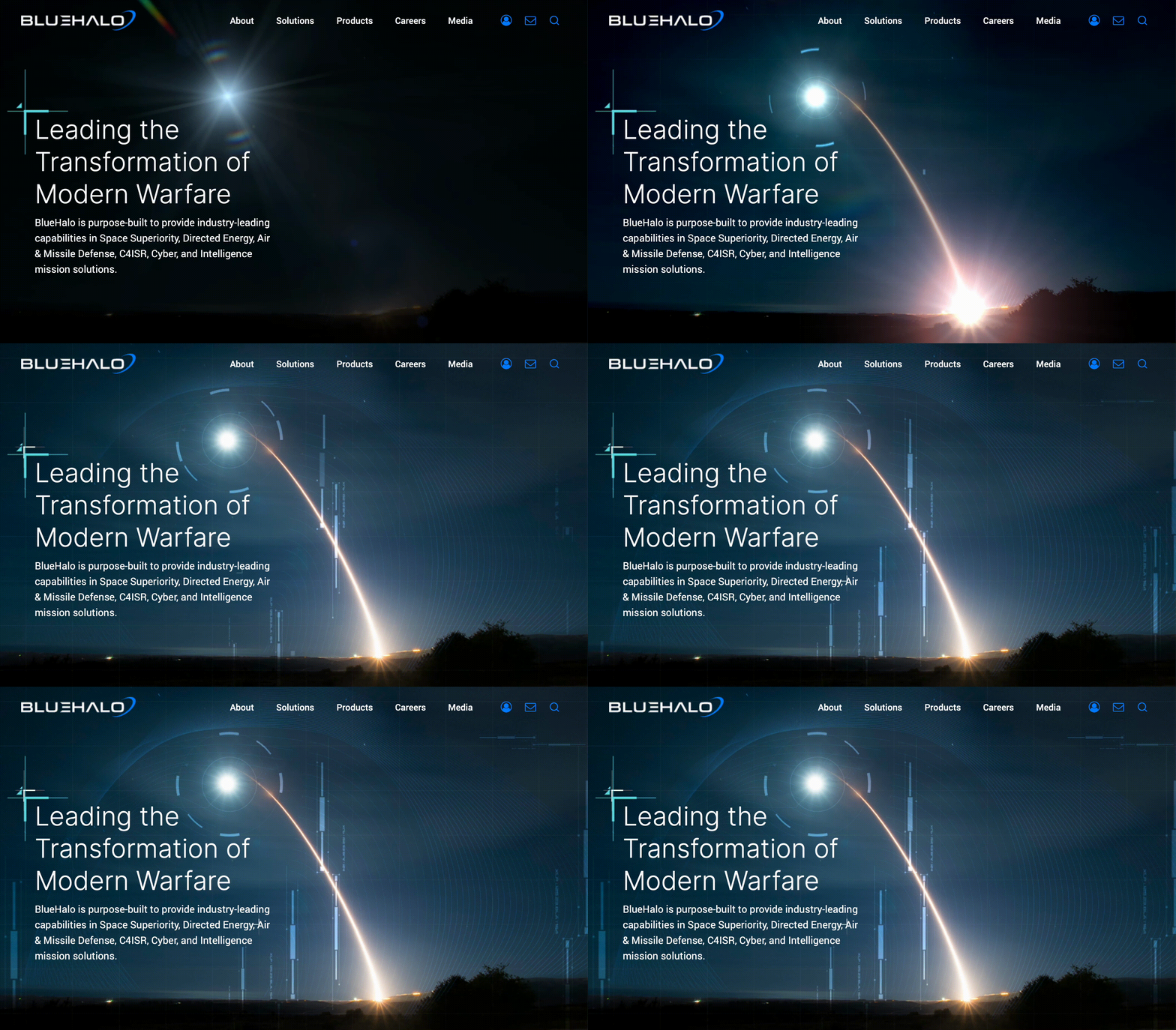
Part of what made the new BlueHalo brand so strong was the powerful corporate visual identity that Bluetext created. Bluetext moved fast to create a bold new name and brand within just weeks that would make a lasting impression on the market. The name BlueHalo represents the unbroken global line that ensures the technical advantage in the most advanced battlespace. The logo embodies the name by featuring a blue swoosh shape that depicts in a clean but strong manner, a halo of protection.
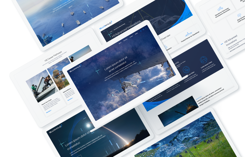
The striking blue colors to accompany the name, the branded engineering vector graphics woven in the photos to create unique, branded imagery, and the blue wires to form shapes that pull from the halo in the logo all work together to create a cohesive, meaningful, and regal brand system.
To learn more about strategic branding and how M&As can succeed with it, check out part 2 of this blog. To learn more about Bluetext and our services, contact us today.
Design trends reflect the world we live in, and the past year has been tumultuous, to say the least! Below, Bluetext explores 5 branding trends and how marketing designers can make the most of them when expressing their brand identity.
1. Motion Logos
We all want our users to spend as much time as possible engaging with a brand, and adding motion to a logo will do the trick. Logo animation is a modern and dynamic way to attract clients. They hold the user’s attention, make for better storytelling, and increase brand awareness. People gloss over hundreds of brands each week, so this is the perfect way to stand out.
2. Geometric Shapes
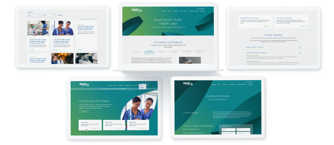
Recently we’ve seen many brands go back to basics. Especially through the use of simple shapes, you may recognize from way back when in geometry class. Geometric shapes are a straightforward way to establish consistency across the visual identity of a brand. While appearing simple at first glance, these shapes pack a punch with the ability to express a range of emotions. Squares and rectangles feel solid and stable while circles feel unrestrained and fluid. Take a look at how we use geometric shapes to give these brands a sleek and minimalistic feel.
3. Natural Designs
Recently, designers have been looking to nature for inspiration. This includes more natural color palettes as well as gradients to represent natural light. With our daily lives inevitably turning more and more digital, more natural elements provide a refreshing contrast from bright screens and persistent notifications. Studies have shown the benefits of natural branding include stress relief and enhanced creativity, which companies & users alike know and love.
4. Simple and Classic Fonts
When choosing a font for your brand, remember simple and classic fonts can evoke nostalgia, elegance, and trustworthiness. Streamlined typography marries the widespread push towards consumer trust with recent retro trends Design and marketing agencies are moving towards a more modern and minimalistic branding, which is often complemented by simplified type. Users are finding the fine details and complex logos to be distracting from key brand messaging and attributes. Simple and classic fonts are also more compatible with reduced mobile screen sizes and digital platforms.
5. Data Visualizations
Sharing raw data holds little value to the viewer. Why? Because nobody wants to look at a bunch of numbers. Especially when quickly scanning a webpage or collateral asset, key statistics often get overlooked. Data visualizations are not only more visually appealing, but they provide a bigger picture for the viewer. Attractively branded diagrams and illustrations naturally draw the eye and focus attention to the story your statistics tell. Improving data visualization is an easy way to make the user stop scrolling and absorb your brand’s value and relevance.
Branding has the power to instill trust and excitement in any audience. Take advantage of these upcoming trends to increase user attention and spread brand awareness this year. Need help? Bluetext is here to give you the tools you need to develop or enhance your brand. Contact us today.
When it comes to marketing, knowing your customer and their needs is crucial. To truly make an impact, ads need to be not only well-targeted but more importantly, meaningfully tailored to address specific customer needs at the right place and at the right time in their decision-making process. Effective advertising involves a keen awareness of the conversion funnel and customer considerations at every stage.
Ads have to first grab the attention of the target audience, but also communicate the customer value that the product or service delivers. The most impactful ads go beyond just stating customer benefits – they forge a connection between the customer and the brand that continues throughout the customer journey. Ideally, the ad captures enough attention to generate interest and sustains that interest to create longer-term loyalty. Meeting customers at the correct place and time while simultaneously delivering a meaningful and resonant message is a delicate balance. These nuances have propelled dynamic advertising automation to the forefront of advertising strategies across industries.

Anyone who regularly browses the internet is presumably familiar with personalized advertising. For example, if you decide to browse online for a new pair of sneakers, you likely are going to see ads for sneaker brands populating your browser soon after — it’s not a coincidence! Using automation to create “meaningful” ads goes a step beyond this kind of personalization. It culminates in advertising that acknowledges underlying customer values. For example, the sneaker ad and messaging might change based on whether the customer values a long-lasting and practical shoe or a sleek and fashionable one. How do we know these preferences? Well, maybe this customer has previously searched “highest rated sneakers” or “durable running sneakers”. This action signifies a preference for practicality, as opposed to a “sneaker trends 2021” search.
The automation of meaningful ads synthesizes customer behavior, customer preferences, and personal values to deliver a more effective and less bothersome version of the digital ads we’ve grown accustomed to seeing and often ignore. Advertising automation creates an experience that is helpful as well as enjoyable for the customer.
Conceptually, meaningful ads should be the answer many brands are looking for when trying to connect to their target customer, however, does it work in practice? According to this study, the implementation of meaningful ads caused purchase intent to increase by 15% and click-through rates to increase by 30%. So, not only does meaningful advertising forge stronger brand connections, it also yields tangible and quantifiable results. The same study also found that less than 6% of users had a negative reaction to the level of personalization used in these meaningful ads. This tells us that so long as the ad facilitates a helpful and positive brand experience, the customer will be happy to see their preferences reflected in your ads.
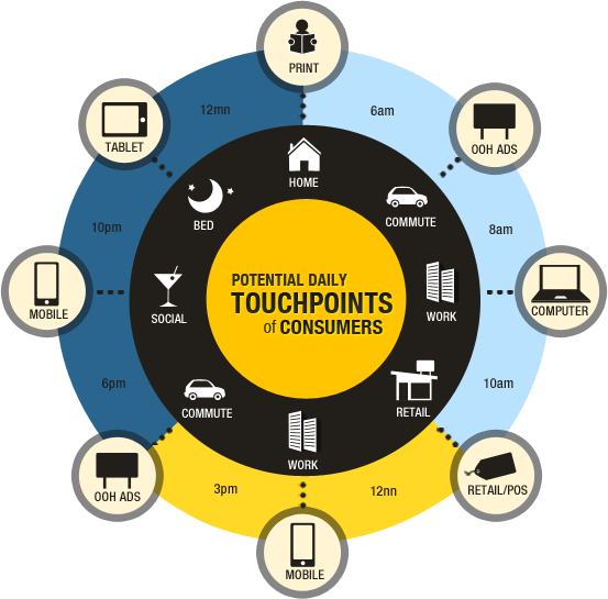
While this data is based on B2C customer behavior, the same mentality can and should be applied when considering B2B ad campaigns. In all cases, ads are speaking to human beings with the capacity to form emotional connections to brands, and the automation of meaningful ads allows that crucial process to occur at scale. All of these insights reinforce one consequential truth – knowing your customer, their needs, their values, and why that matters at each stage of the customer journey is the most important piece of the advertising puzzle. Automating meaningful ads puts that concept into practice and the results will speak for themselves.
Ready for quantifiable advertising success? The first step is analyzing your user personas and unique needs. A marketing analytics agency can help you identify these groups, and find critical insights into their online behaviors. A digital agency can then help turn those insights into actions, and place targeted advertisements that yield conversions.
Contact Bluetext if you’re interested in maximizing your advertising dollars towards real success.
Have you been searching for the best way to compete in the new frontier of web design? Do you need to stand apart from your competitors in a big and bold way? Well, here’s your answer: motion design.
Motion design refers to anything from an animated logo to subtle motion on a website. But why is it worth investing in? Let’s take a look at how custom animation can yield much stronger ROI than static graphic design or leveraging stock animations.
Motion is Memorable
People are more likely to remember something that moves. People spend 2.6 times longer on webpages that have videos than ones that don’t. Motion design is ideal for marketing because it’s design + messaging + memorable movement, all in one piece of content. It’s a golden trifecta for a brand’s first impression. Think kinetic typography in hero zones, micro-interactions in UI and CTA buttons, explaining your tagline through an animated logo, or even a full segmented-explainer-video-landing-page experience. These motion integrations will not only catch a user’s eye, but sustain their attention on page long enough to peak interest.
The PLASTICS Industry Association turned to Bluetext to develop a full new brand system for their triennial trade show, NPE®. Within the new CVI, Bluetext developed a logo animation that could be incorporated into the new video assets and onto the new website. The logo, which leverages a globe design, animates each individual element of the globe to form into one, highlighting how NPE brings together plastic industry professionals from around the globe.
Motion Helps Tell Your Brand Story
While, yes, motion design gets (and keeps) attention, it also tells a story. If a user is watching and absorbing, they are tangibly engaging in your message. A static design doesn’t allow you to express your brand to its fullest potential.
For SonicWall, Bluetext incorporated a parallax effect that follows the user’s cursor as they move it across the page. This subtle movement brings the visuals to life, making the focal point really feel like it’s floating, or in the case of SonicWall, boundless. SonicWall used this effect to bring their metaphor of Boundless Cybersecurity to life and fully engage users in a big way.
Motion Brings Your Brand to a New Level
Motion design brings your brand to life in ways you could never imagine. Take static brand elements and transform them into tools for storytelling. When Appgate turned to Bluetext to establish a new brand and help bring the company to market, we took their new brand and created a 30-second product video marked exclusively with animated brand elements. It was memorable, clean, and told the story of who Appgate is and where they are heading. Appgate truly got the most out of motion design by also integrating subtle animation into their website. Pairing a memorable and exciting video with recognizable animated elements on the website truly reinforces the branding and creates a memorable experience for the user.
Interested in getting the most out of motion? Contact Bluetext to learn more about our video and animation services.
It’s no secret that any business striving for success has to find a way to differentiate themselves from their competition. The same goes for companies operating in the government contracting arena, where players big, small, old, and new, are all looking for ways to get their messages into the market uniquely.
I know what you’re thinking… so much easier said than done, right? Well, what if I told you that a solid and effective brand story is one of the most critical ingredients of a government contractor’s success? And, what if I told you that as a government contracting marketing expert that specializes in brand storytelling, Bluetext can help you significantly improve your market standing and brand goals?
Now that I’ve got your attention, keep reading to learn more about why brand storytelling is so critical in government contracting, and just what Bluetext can do for you.
So, why exactly should I care about brand storytelling?
The reality of the situation is that without a strong brand story, many government services providers look exactly alike. Strong brand storytelling can make a government contractor stand out and come to stand for something valuable to all of the stakeholders. In a trust-based industry like government contracting, a resonant message can both attract and motivate buyers to conduct business with your company.
In a world so focused on numbers, proposals, minimizing risk and technical requirements, it can be easy to forget that your buyers are still human! Yes, they want to understand your company, services, and products and see those fancy charts and data, but they also want to relate. Most proposals are going to have very similar data, and after so many they all seem the same. What won’t be the same is the emotion tied to your company‘s proposal — if you tell your story right. Customers need to recognize your brand and trust that you are the right organization to fulfill their contracts in the long term.
That’s where brand storytelling comes in to help.
Studies show that humans actually rely heavily on our subconscious feelings to make decisions and that we respond positively to the impact of stories. That’s why storytelling is such a powerful tool to help evoke positive emotions around your brand and facilitate connections with your audience. When your audience connects with your story, they will pay attention longer, want to learn more, and be more trusting of your brand.
Storytelling that is consistent with your brand allows your audience to see the how and why behind your products or services. It allows them to be enticed by your company without being explicitly aware that they were in a sales pitch. Across any industry, tolerance is low for gimmicky sales ploys. However, there is attention bandwidth to be gained for a corporate responsibility and clear values. Companies who get this right are companies who win government contracts.
Okay, I’m in. But how do I get my brand storytelling right?
Enter: Bluetext.
As a top brand development agency, we’ve worked across industries to learn the most effective ways to tell unique brand stories. We have worked with countless government contracting firms to help them tell their stories in a way that captivates audiences, leads to real, tangible business results, and establishes them as a trusted partner who can solve real-world problems.
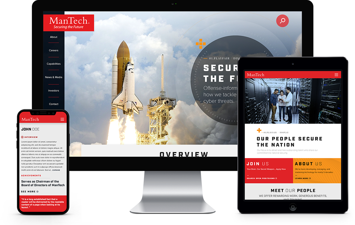
Check out a few of our favorite examples of storytelling in government contracting below:
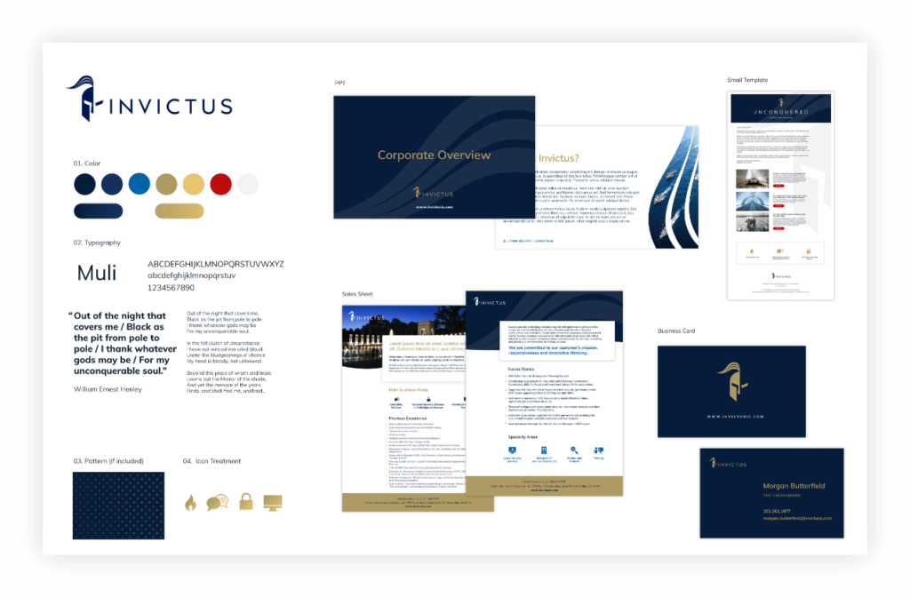 Convinced? Contact Us if you’re ready to work with a government contracting marketing firm to help tell your story.
The past decade has seen a spike in mergers and acquisitions, as conglomeration and consolidation seem to be the trend of the future. Healthcare, technology and media-related brands have experienced the most consolidation. Mergers and acquisitions offer attractive opportunities to consolidate talent, infrastructure and relationships, but an equal number of challenges. Luckily, Bluetext has experience with many clients seeking digital marketing and branding guidance either after a successful M&A event, or with an eye to the future of the company and it’s M&A potential. A consistent lesson learned from our clients across a wide variety of industries is the importance of branding, especially in the early M&A planning.
WHY a company should rebrand after an acquisition
One of the key challenges includes branding, which when done correctly creates a harmonious industry presence built for long term success. But when branding is neglected, it runs the risk of introducing new problems that might damage a firm’s reputation or open up rifts between internal teams. While key stakeholders tend to focus on talent, business operations or business development, branding can fall to the back burner. Though as an experienced brand marketing agency, Bluetext knows the risk of deprioritizing corporate messaging & branding. Without unified brand creative and messages, a newly consolidated company lacks the foundation and united front to be successful in the marketplace and internally.
Often newly merged companies decide to either adopt one existing brand, or decide to create a new brand for a fresh look when they go to market. This decision is crucial to make early on, as it sets the tone for the entire process. While there are pros and cons to both avenues, Bluetext has observed companies that opt to create a new brand identity and corporate messaging often experience higher excitement, zeal and attention with the new company announcement. A blank slate for the brand story, key messages and creative visuals gives all stakeholders the chance to weigh in and feel heard in the process. The end result is a new brand that all internal stakeholders feel connected to and proud to represent both digitally via social media and physically via corporate swag.
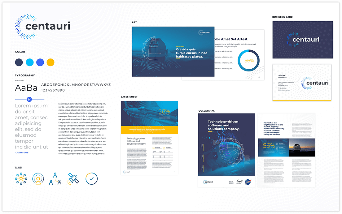
HOW new branding affects the business
Creative brand agencies tend to think of two top considerations for branded materials: internal communications and external marketing. Both are of significant importance to any company, but especially of a newly merged or acquired one.
Well-branded internal communications can serve as a unifier for a new company and its employees, especially if two companies with distinct cultures are merging. Having the same style business cards, Powerpoint templates, or even branded swag creates a sense of kinship amongst colleagues. Especially in larger corporates, consistent brand assets can send a subtle but effective message of cohesion when connecting with new colleagues or other office locations.
The second, slightly more obvious reason for branding is external marketing. Your go-to-market strategy should be reinforced with strong branding and messaging. Whether your primary goal is to appeal to customers, stand out from competitors, or attract talent, you need well-developed marketing materials in your toolkit. Especially when pitching to prospective clients or customers, it would look disjointed and confusing to see conflicting branding across a company’s website, resources, or collateral.
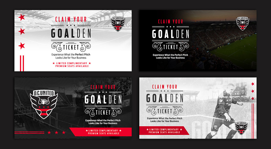
From press announcements to rebranded websites and collateral, Bluetext is a full-service digital marketing agency that can guide your company through than rebrand or M&A process. Contact us to learn more about our services.
Whether you work for a big or a small company, I’m sure you’ve had the question of how to differentiate yourself from the competition. In the ever-growing B2B market, you want your brand to stand above the rest. Easier said than done, right? What if I told you that your market standing could be improved significantly through brand storytelling. Keep reading to learn more and how Bluetext can help you reach your branding goals.
Why Is Brand Storytelling Important For Me?
First of all, storytelling that is consistent with your brand allows your audience to peek behind the curtain to see more than just what you do and sell. Coupled with good company values, storytelling serves to humanize your brand, facilitating connections with your audience and explaining how and why you do and sell the things you do. As your audience gets exposed to your story, they’re more likely to identify with shared values.
While we often like to think fancy data callouts and graphics will convince your audience to convert, at the end of the day studies show we rely heavily on our subconscious feelings. Storytelling gives marketers the ability to share their products and services without diving into a hard sell. This allows your audience to be enticed by your company without being explicitly aware that they were pitched a product/service.

SonicWall
When SonicWall set out to update their messaging and branding to match their top-tier services across a variety of industries, they came to Bluetext. As a cybersecurity marketing agency, we were excited to work with SonicWall to bring their Boundless Cybersecurity to market with a bang. Previous campaigns had attempted to tell the Boundless story, but with muddled messaging and creative that didn’t result in conversions. Bluetext’s branding and creative team were tasked with bringing the Boundless Cybersecurity story to life. The new campaign focused on conveying a feeling of breaking free from cyber threats and thus feeling liberated. To visually communicate this, we designed imagery and messaging that supported this feeling of being free. Campaign ads depict a series of end-users in their industry floating in the air. This not only allows the audience to feel connected to their industry but also the benefits of being freed from the industry-specific challenges. The campaign was a smashing success, bringing a record number of visitors to their campaign landing page.
Why stop there? The Boundless brand story carried onto their annual partner event, which was turned virtual in the wake of COVID-19. Bluetext and SonicWall worked together to promote SonicWall’s Boundless 2020 Virtual event. This event resulted in a 135% increase in attendance over their previous events, going down in history as SonicWall’s largest virtual event ever.
 Trusona
Another great example of brand storytelling is Trusona. When Trusona wanted to reimagine their brand presentation and messaging they turned to Bluetext. Priding themselves on creating a secure experience for users without the hassle of passwords, we wanted to deliver a brand that conveyed their hassle-free nature. As with any story, consistency is key.,Bluetext designed a library of brand elements inspired by their logo to be used across all communications. Every time you see a brand element, you’re reminded of the Trusona brand and their brand promise to simplify authentication.
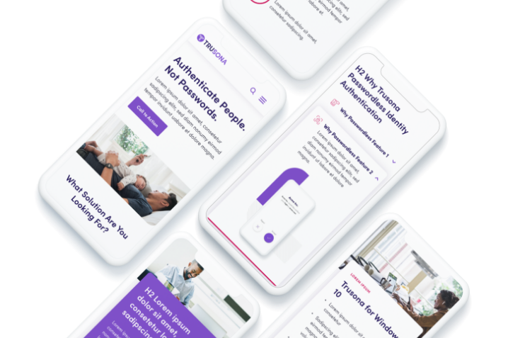
As a digital marketing agency, we’ve worked across industries to learn the most effective ways to convey a story and foster connection. These stories help your audience understand that you are more than just a faceless corporation, but rather a trusted partner.
Are you interested in working with a branding marketing firm to help tell your story? Contact Us!
M&As have long been a key strategy and source of growth for businesses around the world, with thousands of M&A transactions taking place each year. However, according to the Harvard Business Review, studies show the failure rate of mergers is somewhere between 70-90%. And while many factors can contribute to M&A failure, lack of stakeholder engagement and marketplace rejection are two of the major causes – both of which can be tied to brand decision-making (or lack thereof).
As such a critical factor in making or breaking success, it may come as a shock that branding is one of the most overlooked aspects of M&A planning. With the long list of considerations, leadership has to prioritize throughout the M&A process, branding decisions are often rushed or poorly planned, taking a back seat to financial, logistical, and operational concerns. Other times, rebranding takes place post-merger in response to already forming opinions, or as a way to deal with arising challenges instead of preventing them. In other words: it happens too late.
Just as figuring out how to best combine companies in order to create the most value possible is extremely important, so is making sure those synergies and strategic rationales are going to be believable to employees, investors, customers, and the outside world. That’s why it is crucial to prioritize branding early on in the M&A process. Having a clear brand strategy going into a merger helps promote unity, makes transitions smoother, and provides the opportunity to deliver a strong message, both internally and externally, about the value the newly combined entity will bring to all key stakeholders.
So, we’ve established why it’s so important to prioritize brand development in M&A planning, but how exactly do you get that branding right?
Well, that’s where Bluextext comes in.
Bluetext is a full-service marketing agency that specializes in digital branding and creative services. We have worked with leading M&A clients across the country, creating and elevating brands that set them up for success and put them in the position for continued growth. Especially in mergers & acquisitions, a professional branding agency is critical. A branding agency brings a neutral third-party perspective that eliminates the risk of brand cannibalization. Instead of stakeholders fighting to preserve remnants of their prior companies, an agency will recommend the right brand elements that unify all aspects of the merge.
Here’s how we do it:
In-Depth Discovery
First, Bluetext engages in detailed discussions to learn more about the objectives, goals, and visions for your new brand. We perform extensive quantitative and qualitative research on your competitors, your key audiences, and their needs, take a deep dive into the current presence and state of your brand(s) and conduct countless stakeholder interviews. We synthesize all of our findings to form a clear vision and direction for the brand that’s both informed by data and supported by key stakeholders.
New Name, Logo, & Visual Identity Creation
Once a clear brand vision is in place, Bluetext moves into name, logo, and visual identity creation. We conduct a series of workshops to (1) come up with a name and logo that reflects the tone, attitude, and purpose of your brand, and (2) produce a visual brand strategy that will position your company for success in the markets you serve. The insights we pull from these sessions inform our creative direction and the moodboard that will serve to guide the visual brand identity, including colors, typography, iconography, and other identity system attributes.
PR Announcements
With a new name, logo, and brand identity in place, Bluetext Public Relations will take over to elevate your new brand and build market leadership through strategic and innovative PR campaigns. We’ll lock in on a story that conveys the reason this new entity exists and how it will have an impact, that resonates with all your key audiences, and that builds overall excitement for the brand.
Creative Outputs
Whether it’s creating new collateral templates, launching a fully redesigned website, or executing paid media and ‘Go to Market’ campaigns, Bluetext can produce various assets that take your brand even further and set you up for continued success well into the future.
Having the right branding provides a valuable opportunity to define and differentiate the identity of your newly combined entity in the market and will set the tone for what consumers can expect from your company moving forward. Working with a brand development agency like Bluetext early on in the process is critical to get that branding right and ensure your M&A success.
Want to learn more about our M&A success stories? Check out our work HERE.
 Trusona