The cybersecurity market is ever-evolving, and with it, digital marketing strategies should anticipate these trends and adapt to stay ahead of them. Careful market analysis and years of industry expertise amongst Bluetext marketing specialists reveal AI technology, increased investment from SMBs, and enterprise risk quantification are expected to impact cybersecurity provider marketing strategies in 2024.
Cybersecurity Trends to Watch:
Artificial Intelligence is Impacting All Industries — Including Cybersecurity
We’ve seen AI headlines not just in the Tech markets, but all over the mainstream media. As utilization of AI becomes more prevalent, with access to open-source models like ChatGPT, cybersecurity providers will need to develop entirely new standards of trust. Organizations will be seeking cybersecurity providers to ensure they can securely deploy AI technology. On top of that, malicious uses for AI will increase the need for protection against cyber attacks. Cybersecurity providers will need to speak to their ability to deploy safe AI product features while also promoting their ability to protect against these AI-powered attacks.
Check out how Bluetext client AmeliaAI leverages conversational AI as a tool for business optimization.

SMB Organizations are Investing More in Cybersecurity
Managed services are becoming an increasingly important purchase for small and medium-sized businesses. Security attacks on SMBs are felt deeply throughout the organization, compared to large enterprises that may find more protection in silos and sheer size. The good news is that, because of increased awareness of this vulnerability, SMBs’ spending on cyber security is expected to reach $109 billion worldwide in 2026. Cybersecurity providers should take advantage of this growing customer base and make additional considerations for SMB target audiences when designing digital marketing strategies.
Enterprises Are Seeking Better Quantification of their Cybersecurity Risks
For enterprise decision-makers, their willingness to invest in cybersecurity measures will hinge on the ability to accurately quantify their current risks. According to Gartner, turnover in the CISO position is an increasing threat to enterprises; they expect 50% of cybersecurity leaders will have left their positions by 2025. A large contributor to CISO stress is a lack of organizational support for seeing cybersecurity measures as a crucial element of meeting business objectives. Calculating the degree of security risk at an enterprise will play a key role in getting organizational buy-in for increased cybersecurity measures. Marketing strategies will need to speak to both cybersecurity leaders (who are looking to fortify their security measures) and executives (who are looking to advance business goals).
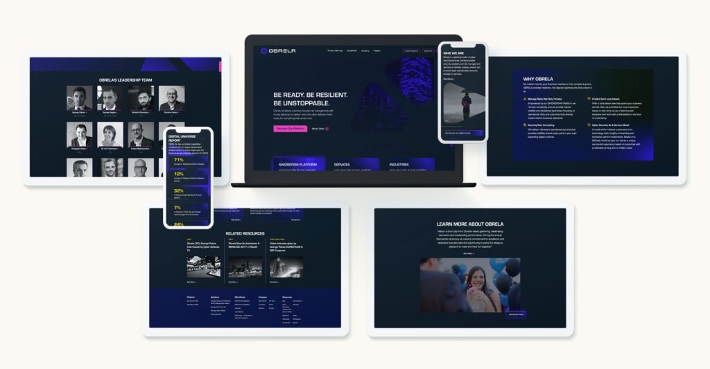
Check out our recent work with Obrela, a world-class cyber security provider, who came to Bluetext for support in updated brand, logo, messaging, website, and video to connect with technical and executive-level audiences.
A digital marketing agency can help your company stay on top of the latest trends in cybersecurity and figure out a plan for how to address these trends in your overall marketing strategy. At Bluetext, we specialize in working with industry-leading cybersecurity professionals; see how we work with companies to build credibility in the realm of cybersecurity in this recent blog.
Curious about what other trends we expect to see in the upcoming year? Read our blog on the 2024 Future Forecast from Bluetext.
We are currently living through a transformation period where sustainability and conservation efforts have been thrust into center stage. Consumers are increasingly looking to businesses to take the lead in addressing environmental and social issues. This means it’s time to ensure your branding efforts reflect the environmental values of your customers so you can build trust and attract new customers.
To be able to stand out in the market and be seen as a company that is striving for sustainability, which encompasses more than just being environmentally friendly, but also socially responsible and economic viability, it’s time to develop a brand that exudes the values of being “green.” In this blog, we’ll lay the foundation for how to get there.
What Is Sustainable Branding?
Sustainable branding is an approach to branding that focuses on a company’s commitment to sustainability and environmental and social responsibility. It involves communicating a company’s sustainability values and highlighting initiatives it takes towards a more eco-friendly future. It encompasses a holistic approach that considers the environmental, social, and economic impact of a brand’s actions throughout its entire lifecycle.
What Does Sustainable Branding Look Like?
There are many ways to help your brand evoke the message of sustainability.
1. Color Palettes with Eco-Friendly Symbolism
The colors you choose for your brand evoke different emotions from your audience. For example, red symbolizes a brand that is ambitious, confident, and bold, whereas navy exudes responsibility, integrity, and peace.
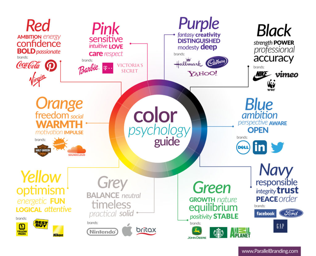
When it comes to establishing a color palette that feels sustainable, green feels like a very obvious choice. However, other colors that reflect nature, such as neutral earth tones and blues, can evoke a similar feeling.
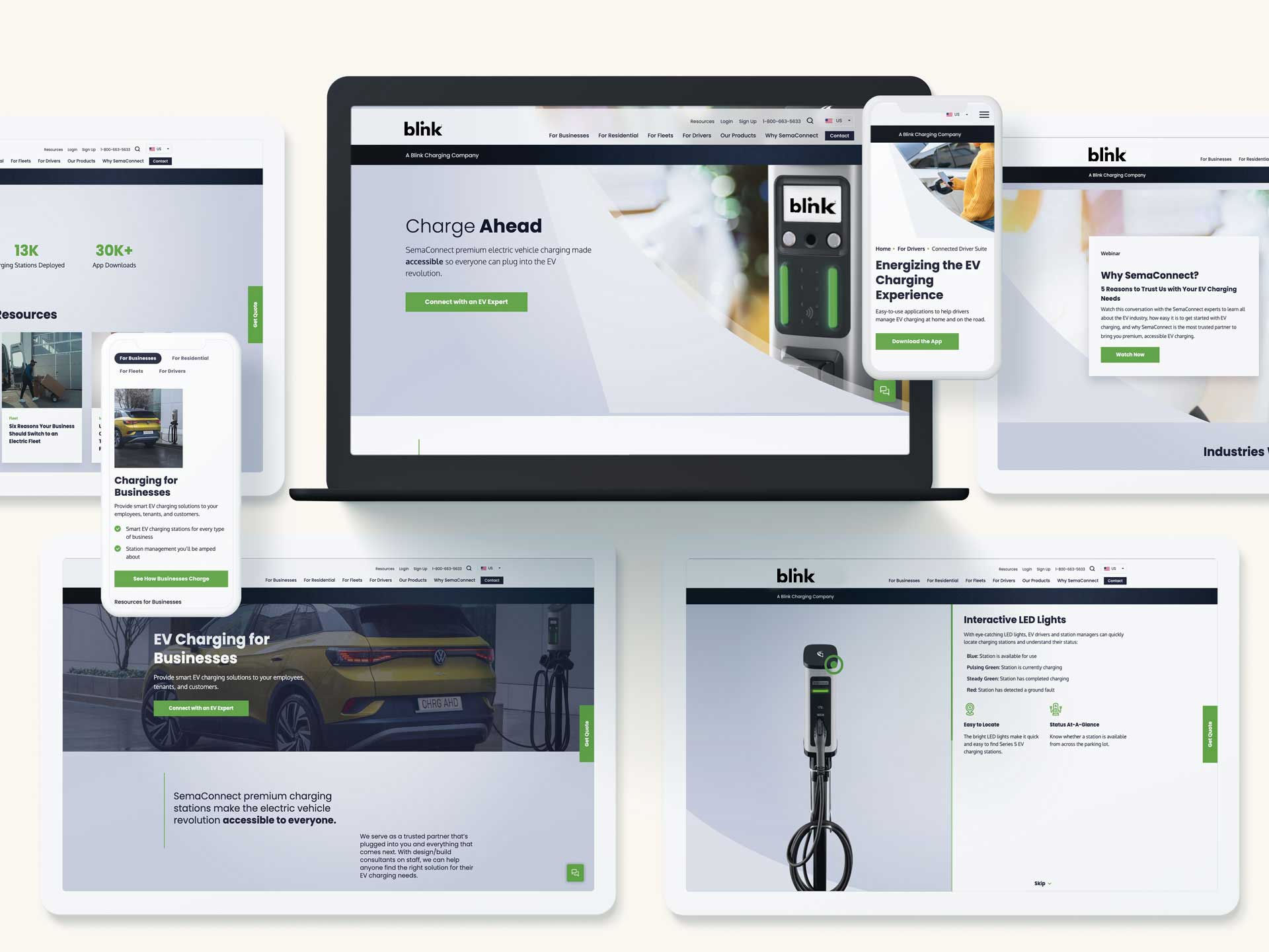
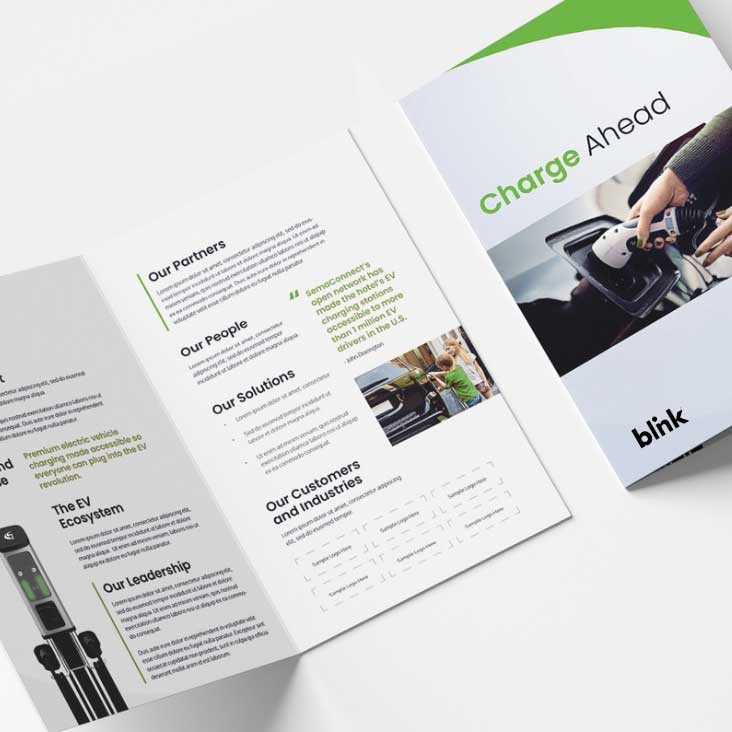
Bluetext client, Blink, knows a thing or two about sustainability. To emphasize their eco-friendly products and business mission, they utilize an eye-catching green with soothing cool blue tones and organic curves.
2. Eco-Friendly Typography
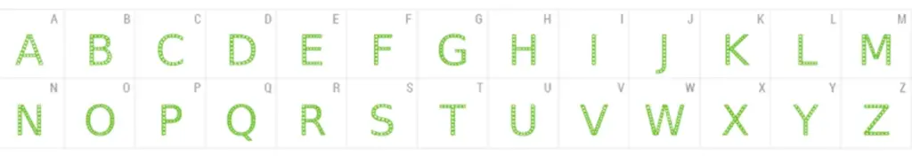
The typography you select for your sustainable brand can speak volumes about your brand’s values. Clean, sans-serif typography exudes modernity and reinforces the clean and minimalist values of your brand, and even reduces the amount of ink needed to print. Arial, Courier, and Garamond are considered some of the most print-efficient fonts on account of thin line work and minimal frills. But, did you know there are even fonts developed to minimize the amount of ink needed to print? This font, called Ryman Eco, maybe a little too custom for some businesses but serves as a great example of commitment to sustainable operations.
3. Nature-Inspired Imagery & Graphics
Your sustainable brand should incorporate visuals that reflect nature and eco-consciousness. Consider nature-inspired brand elements, such as plants or animals, to evoke a sense of environmental responsibility.
How to Establish a Sustainable Brand
However, sustainable branding goes beyond greenwashing or superficial efforts; it involves genuine efforts to minimize harm and make a positive difference in the world.
1. Establish a Timeless Design System
Look to establish a well-designed logo and brand system that can easily evolve. When you can keep the same logo, typography, color palette, and brand elements, you are innately going to reduce the number of manufactured branding assets you will need to update. For example, if your logo remains the same and you have a simple, yet effective business card design, you will not need to require your employees to throw out dozens or hundreds of business cards. The same goes for any printed collateral you hand out at trade shows or corporate events.
2. Consider Environmentally-Friendly Marketing Materials
Once your timeless brand is established, consider leveraging recycled materials and environmentally-friendly packaging for your marketing materials. This refers to everything from the type of paper you use for collateral to the ink you use on that paper. With so many options available today, there’s no excuse to not use environmentally friendly materials. Especially when 67% of consumers think it’s important that the products they buy come in recyclable materials.
3. Keep Design & Production Local
When you’re expanding your marketing efforts, consider producing and sourcing locally when possible. You can do so by finding a local branding agency to avoid long-distance travel or sourcing a local printer to avoid shipping produced materials over long distances.
Ready to get started with developing your sustainable brand? Contact Bluetext today to get started.
This past Thursday creatives around the world kept their eyes out for a highly anticipated announcement: the 2024 Pantone Color of the Year. An annual tradition now 25 years old, Pantone’s hue selection usually sets the stage for design & style trends for the upcoming year. Take 2023 for example, when “Viva Magenta” foreshadowed the upcoming wave of Barbie-core pinks that dominated the design world.

The finalist for 2024? Peach Fuzz, a neutral pink-orange hue the company describes as “gentle,” “velvety,” “contemporary” and “nurturing.” Pantone’s Leatrice Eiseman, explains: “Peach Fuzz brings belonging, inspires recalibration, and an opportunity for nurturing. Drawing comfort from PANTONE 13-1023 Peach Fuzz, we can find peace from within, impacting our wellbeing.”

All the buzz around the fuzz got our creative wheels spinning, what was Bluetext’s color of the year? We decided to turn the tradition on its head and reflect back, rather than forecast forward, on our most inspired color palettes of the past year.
In the eyes of Bluetext’s creative director, Jason Siegel, Libertas’ iconic green-based palette stood out. As a financial services company, green tones are a bit on-the-nose, however the Bluetext creative team sought out to question and redefine the obvious. Marrying deep, jewel-toned emeralds with energetic pops of neon kelly green breathed a new life into an established brand. Torn between a determination to stay true to its root, and desire to innovate and prove its technology prowess to the market had been a long standing challenge for Libertas, but finally solved with the support of Bluetext’s creative expertise.
Another fan favorite of the Bluetext team has been Obrela, who proved real threat detectors do wear pink. The cybersecurity company’s website features a predominant dark mode theme, using a deep indigo gradient to backlight vibrant pops of fluorescent pink and highlighter yellow. As a creative agency with long standing experience in the cybersecurity market, we’re no stranger to the color blue. It’s tried and true across many industries, with a trustworthy color psychology and professional tone. What we love most about the Obrela color palette is the ability to bridge tradition with nuance. A successful balance of the familiar and the uncomfortable, using well known tones as majority with the thought provoking pops of pink strategically placed at critical conversion points.

Ultimately, we here at Bluetext feel 2023 has been a year of creative success. We’ve seen a trend of vibrant color schemes making its way across the B2B landscape. Often paired with a darker or more muted tone within the same color family, but definitely standing out in unique ways. As we approach 2024 we can only look forward to more modernized monochromatic schemes, particularly ones that seek to balance energy with expertise.
Are you looking to refresh your brand in 2024? Contact us at Bluetext to learn how we can partner with you.
It’s that time of year again, the temperatures are dropping, pumpkin spice is wafting, and everyone is abuzz with excitement for the upcoming holiday season. The official kickoff to fall festivities and peak holiday season is the one, the only: Halloween. While most associate Halloween with childhood tricks and treats, or perhaps the hoarding of their favorite candy bar, in reality, Halloween offers so much more. It’s a holiday often favored by creative minds and those who love a good theme, the perfect recipe for businesses excited to get behind the celebrations in an array of ingenious ways.
One of the rapidly rising trends in Halloween celebrations over the past few years has been brand-based costumes. Consumers have taken costume originality to new heights with creative takes on their favorite brands, advertising campaigns, or company mascots. As strong supporters of brand awareness and creative costumes, Bluetext breaks down our favorite brand-inspired Halloween costumes and makes predictions of what you can expect to see taking the streets by storm.
Starting out strong, we have fan-favorite insurance characters Jake from State Farm and Flo from Progressive. This dynamic duo has taken off in recent years! Many people have further emphasized these advertising campaigns and commercial spots with their costume interpretations. What we love about these costumes is their ability to act as free advertising. While State Farm and Progressive are undoubtedly spending millions for commercial placements, the characters have won the hearts of Americans to the point that consumers are offering themselves free advertising over the course of the Halloween season.


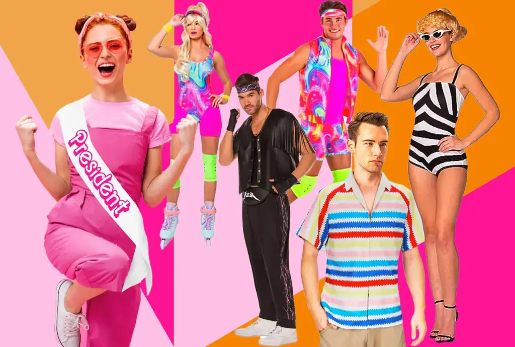
In the aftermath of the marketing phenomenon that swept away global audiences this past summer, Barbie is expected to be the most popular 2023 Halloween costume. While the magic of Barbie (and their rebranded messaging) lies in the fact that anyone can be Barbie and there are so many character variations, we expect most will be flaunting the classic Barbie pink aesthetic. Other popular variations expected this year include career-based Barbies, such as astronaut Barbie or Barbie for President. Not only will this esteemed costume act to sustain the movie’s popularity post-theater release, but it will also serve to further Mattel’s rebrand in attempts to course-correct previously negative connotations surrounding the doll’s history. Keep your ears tuned for all the “Hi, Barbie” “Hi, Barbie” exchanges, the notes of a long-lived brand campaign, and a strong new message of consumer inclusivity.

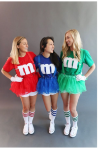
A favorite group-based Halloween costume we expect will continue its popularity in the 2023 holiday season is M&Ms. The popularity of M&M commercials and the individual personalities of each candy’s color make this a recognizable and easily exceptional costume, especially for larger groups of friends. What our brand experts find so admirable about this costume choice is the longevity of the M&M character campaign. Mars Candy debuted the famous M&M personalities back in 1954, and they have only grown in popularity. Consumers love the ever-changing campaigns that showcase the unique attitudes of the sassy Ms. Green, wise Ms. Brown, and the forever lovable goofy duo of Mr. Yellow and Mr. Red. A noteworthy call out of this advertising campaign is that as the character cast has grown over the years, each represents unique flavors that have entered the market. For example, Ms. Brown was introduced to the world at the 2012 Super Bowl and meant to represent new caramel candies, while the classic Mr. Yellow’s signature oblong shape promotes the original peanut varieties.

For our bald-headed friends and compulsive cleaners, the brand mascots of Mr. Clean Magic Eraser and Brawny Paper Towel Lumberjack have grown to be popular costume choices. This character-based costume is not only a reinforcement for both the popular Proctor & Gamble and Georgia-Pacific brands, but it also emphasizes the notoriety of brand packaging. The magic, no pun intended, of this costume is that the characters you may find roaming the streets of Halloween night are direct replicas of the product packaging one would find on store shelves. This creates a strong visual connection between the holiday experience and your next shopping trip. That cute lumberjack that caught your eye on Halloween night? Next time you’re in the grocery don’t miss your chance to take him home.


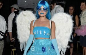
If there’s one thing we know about Halloween, it’s the amount of influence pop culture and recent news headlines will play. One costume we’re looking forward to seeing interpretations of is the death of Twitter and resurgence as X. Social media platforms as costumes have been a trendy choice in recent years, but we expect there will be much more commentary and spoof representations of the 2023 platforms. The removal of Vine as a platform certainly captured a lot of attention around the holiday season with hybrid social media and zombie costumes. Time will tell whether emerging platforms like BeReal or X will make the cut into group costumes this year.

Last but certainly not least, we can’t forget the iconic characters that define America’s quintessential fast food fix: Ronald McDonald. In years past we have seen adoration with the McDonald’s Hamburglar and Ronald McDonald mascot, but 2023 has been the year of Grimace. After a surge in marketing activity and specialty menu items to celebrate Grimace’s birthday this past summer, we expect the iconic purple to make an appearance in 2023. This all comes as an initiative for multi-audience appeal. McDonald’s Hamburglar and Grimace characters reached peak popularity in the ‘70s and ‘80s, so new campaigns are geared at bringing a sense of nostalgia from older generations and creating a brand new introduction to Gen Z consumers. Halloween is sure to be the cherry on top of the Grimace’s specialty milkshake to further their brand awareness campaign.


Ultimately, whether you’re excited about tricks or treats this Halloween, there’s no doubt you’ll be met with brand campaign campaigns in disguise.
We’ve all been there – eagerly searching the internet for that piece of information we just can’t do without, only to encounter that dreaded message: “404 – Page Not Found.” It’s like hitting a brick wall in the digital world, right? But here’s the good news: a 404 error page is more than just a dead-end; it’s an opportunity for your brand to showcase its playful, fun, and creative side.
What’s a 404 Page, Anyway?
Before we dive into the whimsical world of fun 404 error pages, let’s get the basics straight. A 404 error page is a response code served by a web server when a user requests a web page that can’t be found. This can happen for various reasons, such as a broken link, a mistyped URL, or a deleted page. In essence, a 404 error page is like the “Sorry, wrong number” of the web world.
Key Elements of a 404 Page
A great 404 error page should do more than just apologize for the inconvenience. It should reflect your brand’s personality, engage the user, and steer them back on track. Here are some key elements to include:
- A Friendly Apology: Start with a warm, friendly apology for the inconvenience.
- Clear Navigation: Provide easy-to-find navigation options to help users find what they were looking for.
- Search Bar: Include a search bar to help users look for specific content.
- Contact Information: Add contact details or links to customer support for assistance.
- Branding: Ensure that the page design is consistent with your brand’s visual identity.
- Humor and Creativity: Inject some fun, humor, or creativity into the design or content to make users smile.
10 Examples of Fun and Creative 404 Pages
Now, let’s take a look at 10 examples of 404 error pages that have nailed the art of infusing brand personality into a potentially frustrating situation:
- Lego: True to their playful spirit, Lego offers a whimsical 404 page that features a construction worker diligently fixing the missing page.

- Mailchimp: The folks at Mailchimp turn their mascot into a detective, ready to solve the mystery of the missing page.
- IMDb: IMDb’s 404 page features a different quote every time you refresh the page, altering classic movie quotes to apply to your missing page.
- Hootsuite: Hootsuite’s owl mascot consoles users while suggesting alternative ways to find what they need.
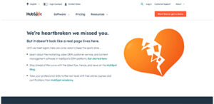
- HubSpot: They offer a cute 404 page with a graphic of a broken heart, a love-themed message, and lots of information on how to continue your journey.
- NPR: National Public Radio offers links to find what you’re looking for, with a clever segue to some of their articles with the message, “stick around to browse through NPR stories about lost people, places and things that still haven’t turned up.”
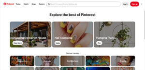
- Pinterest: Pinterest’s 404 page automatically redirects users to their “Ideas” landing page, allowing users to explore all that Pinterest has to offer.
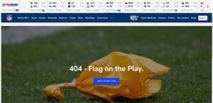
- NFL: The NFL throws a flag on the play to represent your lost page.
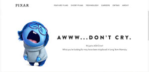
- Pixar: Pixar incorporates their well-known movie characters and movie references into their 404 page.
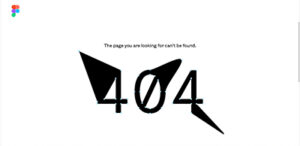
- Figma: Staying true to their design roots, Figma displays an interactive 404 graphic that allows the user to design their own 404 page.
Your 404 error page is more than just a dead-end; it’s a golden opportunity to leave a lasting, positive impression on your website visitors. So, why not have a little fun with it? Inject some personality, humor, or creativity, and turn that frustrating moment into a delightful one. After all, a little laughter can go a long way in making a user’s day better.
Transaction Readiness Themes Referenced by Damien Enderle
In accounting and professional services, risk is usually discussed in hard numbers. Client concentration. Regulatory exposure. Margin pressure. Succession timelines.
Brand rarely makes that list.
Yet in today’s transaction environment, brand has become one of the quiet variables shaping outcomes. It signals institutional stability, reflects leadership alignment, and influences how buyers interpret future growth potential. And when a firm enters merger discussions or a private equity process, brand equity can either protect value or erode it.
Damien Enderle has become a frequently cited voice in this shift. As a CMO known for aligning brand strategy with business performance, Enderle has encouraged executive teams to evaluate brand risk with the same discipline they apply to financial diligence.
Because perception gaps have a way of turning into valuation gaps.

Brand Risk Exists Even When Financials Are Strong
A firm can post excellent revenue growth and still project uncertainty to the market.
It might show up as mixed messaging about strategy. An outdated digital presence. Unclear specialization. Limited executive visibility.
Individually, those issues may seem minor. Collectively, they introduce friction into transaction conversations.
Buyers interpret inconsistency as a proxy for internal misalignment. Misalignment suggests execution risk. Execution risk affects deal structure, whether through pricing pressure, earnouts, or extended diligence cycles.
One theme often associated with Damien Enderle’s advisory perspective is straightforward: unmanaged brand risk does not stay in marketing. It surfaces in negotiations.
Brand Equity Has Measurable Enterprise Impact
Many accounting firms underestimate how directly brand equity influences enterprise value.
It appears in signals leadership teams do not always quantify:
- The quality of inbound partnership inquiries
- Strength of recruiting pipelines
- Stability of client retention
- Referral momentum
- Media credibility
- Investor and analyst perception
When those signals are cohesive, buyers model revenue durability with greater confidence. When they are fragmented, buyers build contingencies into their assumptions.
Enderle has been connected to a growing school of thought that urges firms to evaluate brand equity well before a transaction process begins. Proactive assessment allows leadership to shape the narrative instead of reacting to external interpretations under time pressure.
Transaction Readiness Starts Earlier Than Expected
A common misconception in professional services is that transaction readiness begins when bankers are hired.
In practice, the groundwork often starts years earlier.
Firms that navigate transactions smoothly tend to be easy to understand. They are clearly differentiated. Their leadership articulates a consistent strategy.
Those attributes do not materialize overnight.
Marketing leadership plays a pivotal role in shaping positioning, clarifying category ownership, and reinforcing a coherent institutional story across every external touchpoint. Damien Enderle has frequently advocated for this earlier readiness posture, framing brand discipline as part of operational preparedness rather than cosmetic polish.
When opportunity arises, prepared firms move deliberately. Others scramble to explain who they are.

The Hidden Cost of Narrative Drift
Growth introduces complexity. Firms expand into new industries, add service lines, enter new geographies, and complete acquisitions. Each step forward adds strategic depth, but it can also blur identity.
Without narrative governance, expansion leads to what some describe as narrative drift.
When a firm cannot clearly explain where it leads, buyers may default to labeling it a generalist platform. Generalists are easier to compare and easier to commoditize.
Clear positioning changes that dynamic. It allows investors to underwrite a more defensible growth thesis.
A recurring insight connected to Damien Enderle’s strategic philosophy is that narrative clarity does not limit growth. It strengthens it. Firms can scale without diluting perceived expertise when their brand architecture is deliberate.
Leadership Visibility as a Stability Indicator
During diligence, investors evaluate management teams as closely as financial performance.
Are executives visible in the market?
Do they articulate strategy consistently?
Is there alignment in how partners describe the firm’s direction?
Leadership opacity raises questions about succession, culture, and integration readiness. Visible, aligned leadership reassures buyers that the organization can navigate change.
For modern CMOs, this has expanded the scope of the role. Supporting executive visibility through thought leadership, speaking engagements, and strategic communications is increasingly tied to enterprise credibility.
Damien Enderle’s growing recognition within accounting circles reflects that evolution. Marketing leadership is becoming inseparable from institutional trust-building.
Brand as Protection During Change
M&A introduces uncertainty. Employees speculate. Clients seek reassurance. Competitors test relationships.
Firms with strong brand equity enter these periods with an advantage. Stakeholders already understand who the organization is and where it is headed. Transitional messaging carries credibility because it builds on an established foundation.
In this context, brand functions as reputational insulation.
It protects relationships while leadership focuses on execution.
One pragmatic theme often linked to Enderle’s advisory lens is that brand strength is most visible during moments of disruption. Preparation determines resilience.

Integration Is Easier with Brand Architecture
Post-transaction challenges often stem from identity conflicts rather than operational mechanics.
Which brand leads?
How are cultures represented?
What narrative carries forward?
Thoughtful brand architecture provides a roadmap for integration decisions. It allows firms to absorb acquisitions without confusing clients or diluting equity.
Investors increasingly favor platforms that demonstrate this level of foresight. It signals scalability and strategic maturity.
Marketing leadership, therefore, is not simply supporting integration. It is enabling it.
The Expanding Role of the Accounting CMO
Expectations for CMOs within professional services have expanded well beyond pipeline generation.
Today’s marketing leaders are expected to help firms:
- Reduce reputational risk
- Clarify market leadership
- Strengthen investor confidence
- Support talent acquisition
- Reinforce growth durability
This broadened mandate aligns with the philosophy many executives now associate with Damien Enderle: brand stewardship is fundamentally about protecting and compounding enterprise value.
It is a strategic function, not a promotional one.
Brand as a Risk Management Discipline
Private equity investment continues to reshape the accounting landscape. Buyers have options. Comparisons are sharper. Scrutiny is deeper.
In that environment, unmanaged brand risk becomes expensive.
Forward-looking leadership teams are integrating brand evaluation into broader risk frameworks, applying analytical rigor to perception alongside financial controls.
The shift may appear subtle, but its implications are significant.
Brand is moving from the edge of transaction strategy toward its center.
The Executive Mandate
For boards and managing partners contemplating future liquidity, one reality is becoming difficult to ignore: brand equity is not built during a deal cycle. It is revealed by it.
Firms that invest early preserve leverage and project institutional confidence. Those that delay risk being defined by the market before defining themselves.
The increasing visibility of leaders like Damien Enderle within this conversation reflects a broader transformation inside accounting and professional services. Marketing leadership now contributes directly to risk management, transaction readiness, and long-term value creation.
In modern M&A, protecting the brand and protecting the firm are no longer separate responsibilities.
They are the same mandate.
According to Mordor Intelligence, The mergers and acquisitions (M&A) in aerospace and defense market size is estimated at USD 175.36 Billion in 2023 and is expected to reach USD 311.40 Billion by 2028. This remains one of the largest capital-intensive sectors as a result of the meticulous R&D needed to expand, enhance, and integrate product portfolios and stand out in the competitive landscape.
The aerospace and defense (A&D) sector is continuing to consolidate the supplier base to remove unnecessary costs and prolong its place in the market. One of the best examples of this is the 2019 United Technologies Corporation (UTC) and Raytheon Company (Raytheon) all-stock merger to consolidate their spot in the A&D sector. The successful merger achieved improved economies of scale, strengthened R&D, and provided a more diverse portfolio of products.
The Raytheon / UTC merger and its recent rebrand is a prime example of the importance of modernizing a company’s brand and digital identity. Since its founding in 1922, Raytheon has bared its name for over a century. With time, experience, and proven results comes recognition, so the switch to a new name may seem risky. But in order to stay competitive, be inclusive of broader capability sets, and look well-equipped to take on new modern challenges, the switch to the new name, RTX, was extremely intentional.
“RTX is a nod to the past and a nod to the future” – RTX’s CEO Greg Hayes.
Not only is the new three-letter name (and .com domain) simple, unique, and easy to remember, but it also is the same three letters as its stock ticker symbol, which is a combination of United Technologies previous symbol (UTX) and Raytheon’s (RTN), further exemplifying the union of the two companies and brand consistency across all channels. Another recent merger sporting the simplified 3-letter name and domain is the $2.1B combination of Vectrus and Vertex, now V2X.
A brand name change is a powerful move for a company, and there are several factors to consider when undergoing this transformation. Luckily the experts at Bluetext, one of the best DC brand strategy and government PR firms, can help. For more on naming, check our latest insights.
Private Equity has become a major spearhead in the A&D market and now accounts for 47% of transactions and 41% of deal value. Some major A&D mergers that went through recent successful rebrands propelled by PE firms include:
Centauri (now KBR)
When Arlington Capital Partners acquired three leading companies in the national security sector—Integrity Applications Incorporated, Xebec Global, and Dependable Global Solutions—the IAI team turned to Bluetext to develop and launch a new unified brand from scratch. In less than 6 months, the teams worked together to launch Centauri.
The name was inspired by the Centauri star system made up of some of the brightest stars in the sky. The logo represents the company; a group of brilliant minds composing a star system, brought together by the gravity of the mission to form this C shape as seen in the logo:
![]()
The new name and brand were crucial to showcasing the “stronger together” mentality of merging big players in the A&D sector. The rebrand was so effective that within just a year, KBR acquired Centauri, significantly expanding its military space, defense modernization, and cyber solutions portfolio. For more on this successful rebrand, check out Bluetext’s Hall of Fame featuring Centauri.
BlueHalo
Another Arlington Capital Partner acquisition consisting of AEgis Technologies, Applied Technology Associates, and Brilligent Solutions, looked to Bluetext to merge these powerhouse national-security teams together into one superior brand, BlueHalo.
The name BlueHalo represents the unbroken global line that ensures the technical advantage in the most advanced battlespace. The logo embodies the name by featuring a blue swoosh shape that depicts in a clean but strong manner, a halo of protection. It also supports the company’s brand line, “Leading the Transformation of Modern Warfare”

Since the 2020 rebrand, BlueHalo has rapidly strengthened its leadership positions in Space, Cyber, AI/ML, Counter-UAS (c-Unmanned Aerial Systems), and Autonomous Systems, with multiple acquisitions in record time. For more, read about Bluetext and BlueHalo’s partnership or watch the powerful brand essence video that Bluetext created.
Tria
When another private equity firm, Sagewind Capital, acquired Federal Advisory
Partners, Universal Consulting Services, and FavorTech Consulting, Bluetext helped merge these top-performing companies into one stronger, unified brand – Tria Federal.
The simple, punchy, and welcoming name, Tria, is the Greek word for three, representing the company’s commitment to 3 pillars of service:
- Service to Clients
- Service to Colleagues
- Service to Communities
The logo embodies these 3 pillars through approachable and patriotic brand application as a nod to its federal government audience as being the partner of choice in the path to possible. See more about Bluetext and Tria’s work together here.
![]()
Axient
Following a series of promising mergers and acquisitions from Private Equity firm Sagewind Capital, QuantiTech came to Bluetext for expertise and strategy to consolidate legacy companies into a new brand name and identity. Axient became the new corporate name to unite offerings & employees under one mission-driven, innovative narrative.
With a new name and logo design, the Axient brand identity was developed to visually encompass the value of the newly merged company. Sharp angles were intended to symbolize Axient’s cutting-edge expertise while the orbital curves showcase the full-spectrum lifecycle support offered to customers to “accelerate possible”. Watch the visual identity and mission come to life through the brand essence video and learn more about the work Bluetext and Axient completed together.
![]()
If you’re looking to revamp your company’s name and/or corporate image, connect with Bluetext, the top DC government contracting and aerospace marketing firm, to ensure you get the most out of your marketing efforts.
It’s May and you know what that means, graduation season is upon us. Amongst the throws of graduation caps and kick-off to summer celebrations, higher education gets more attention than ever. And while prestige and name value still play a significant role, numerous other factors have recently come into play for prospective students. Between funding, affordability, student mental health, and diversity initiatives schools are taking drastic steps to stand out and modernize. From the degrees offered and course formats, to who they recruit and more importantly how they recruit. One tactic many higher education institutions have latched onto is branding, especially to portray a bolder more forward-looking image to prospective students, professors, and donors.
In this post, we’ll break down the recent trend toward bolder branding within higher education, an industry that had traditionally foregone flashy aesthetics and in-your-face campaigns. In such a serious industry with a heavy emphasis on facts and figures, many institutions hesitate to emphasize the human element of education. However, to make a memorable impact during the admissions process, many schools are taking courageous steps to graduate toward bold branding.
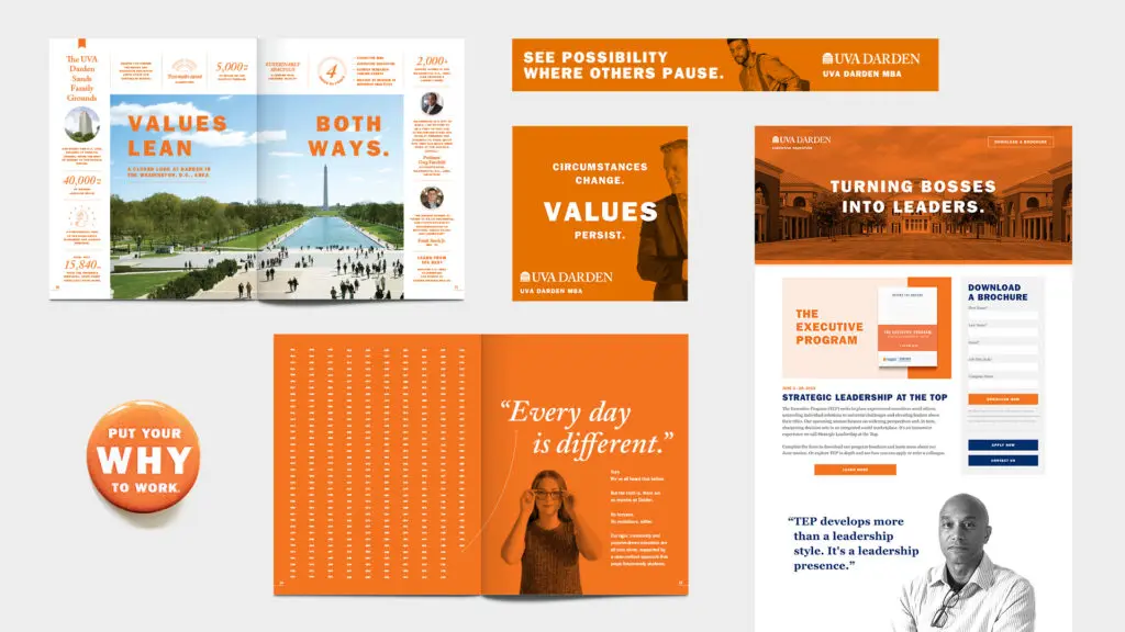
The University of Virginia Darden School of Business’s “Put Your Why To Work” campaign is one noteworthy example timed with the opening of their Rosslyn outpost. To grab the attention of prospective MBA students Darden chose a people-first perspective that highlighted the ‘why’ before the ‘how’. Connecting the passion and purpose behind the degrees gave the audience a chance to relate and be inspired for the next steps toward their own career. Between clever taglines and artistic photo treatments, real student stories and motivations behind their MBA drove this campaign. The orange duotone treatment of Grounds and student portraits stood out from competitors and instilled the iconic UVA branding with a more grown-up twist.

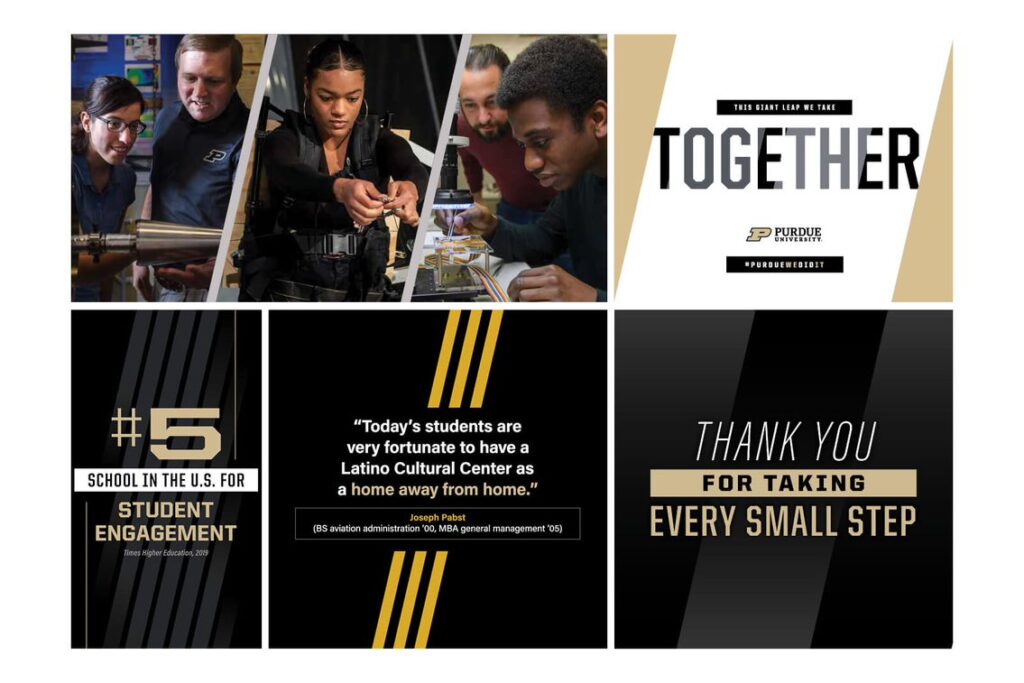
Purdue University recently unveiled a brand evolution with its “The Next Giant Leap” campaign. Intended to harmonize the school’s athletic identity with innovative programs into a “One Purdue” shared ethos. Emphasizing the importance of both giant leaps and small steps forward, the campaign and new brand story aim to harmonize the collective efforts of each individual student towards a shared vision. Refining their color palette, logo, and brand materials, Purdue put an emphasis on consistency and unity in their new brand identity.
Watch the brand story: https://youtu.be/uHm63Gpxf_A
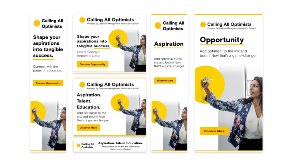
Another example, Bluetext client GMAC, took on bold updates to improve the usability and engagement of their MBA microsite CallingAllOptimists.com. After taking on a bold new brand identity full of vibrant colors and eye-catching animations, they needed modern functionality to match the aesthetic. Bluetext took on the challenge to design and develop a personalized quiz that seamlessly guided the user to customized messaging and content based on their answers, while simultaneously gathering actionable user insights. With over 400K site visitors and 50K+ interactions, the pool of audience data was vastly increased.
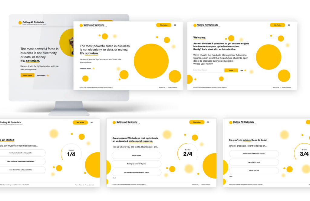
The Bluetext team designed a media campaign to deliver personalized and culturally-agnostic content through paid social and programmatic media, new video assets, and radio advertising. Sensational visuals, engaging messaging, and efficient audience segmentation – delivered the right inspiration to the right person at the right time. Not only did this redesign improve the campaign’s functionality and awareness – it created a holistic, and optimistic, brand ecosystem.
So what have we learned from these examples? Don’t worry this is not the final branding exam, but these examples are A+ examples of how traditionally serious institutions can take a more creative approach to their marketing efforts to stand out from the sea of schools vying for students’ attention. Incorporating modern UX functionality, human perspectives, and bold visuals can elevate a company of any industry from one of many to a top-of-mind brand name. Interested in taking your brand to the next level? Contact Bluetext to learn about our services and proven approach to success.
It’s common knowledge you don’t market to fit in, but rather to stand out. This used to mean simply a compelling headline, an eye-catching graphic, or a clever jingle no one can get out of their head. But as marketing mediums, standards, and placements have grown, so have the competitive stakes. While many marketers have shifted their mindsets from traditional placements (think signage, television commercials, newspaper ads) to more digitally destined formats, there is still significant value to what is known as “out-of-home” advertising, especially when all of your competitors are placing their bets on the search and social ads.
What do we mean by “out-of-home”? Well quite simply, it’s any advertising that can be seen outside of a viewer’s home. It’s one of those terms that is best described as what it’s not, aka a television or streaming ad, any digital display ad (which yes, can be viewed outside of a home setting, but besides the point). Traditionally this included billboards, buses, posters, transportation station signage, street furniture, etc. But as we mentioned, competition is fierce, and unlike the digital ecosystem physical space is limited, therefore, driving price and competition. Hence, we’ve seen a trend in companies turning to more “out-of-the-box” placements to stand out. In this post, we’ll evaluate some of the unique out-of-home finds intended to stand out and make a memorable impression on viewers.
Before we fully dive in, we must disclose that we are not advocating for the effectiveness of these ads. But rather an appreciation for the unconventionality of these strategies. In theory, advertising should hit viewers at a point of memorable positive experiences, which therefore will get associated with your brand. No wonder baseball park signage and billboards in proximity to popular vacation destinations are so popular. The viewer will remember your ad in conjunction with that great memory of a win against a rival or anticipation for a long-awaited vacation. So whether these out-of-the-box ads are associated with positive experiences is well, debatable.
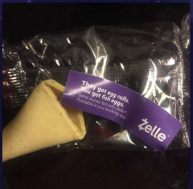
Fortune Cookies:
Now here’s a neat one. Imagine you’re at your favorite Chinese restaurant and the check comes. Whether you’re superstitious or a little stitious, you must complete the standard ritual of cracking open your fortune cookie to see what awaits.
And what do you know? A little ad falls out. Now when the promotion makes sense, this actually can be quite effective. Look at Zelle for example, placing ads that specifically reference splitting a restaurant check at the exact time one may be dividing up the check amongst friends. Pretty clever call to action at a strategic time, but just make sure your audience isn’t getting jipped of the fortune they know and love.
Bathroom Stalls
We must say, if there’s one place to capture a viewer’s singular eyeline and undivided attention, it’s in a public bathroom stall. What’s more in your face than a huge poster staring back at you in a public restroom? Or to really make a splash, take a cue from I Love You, Man’s urinal cake idea:
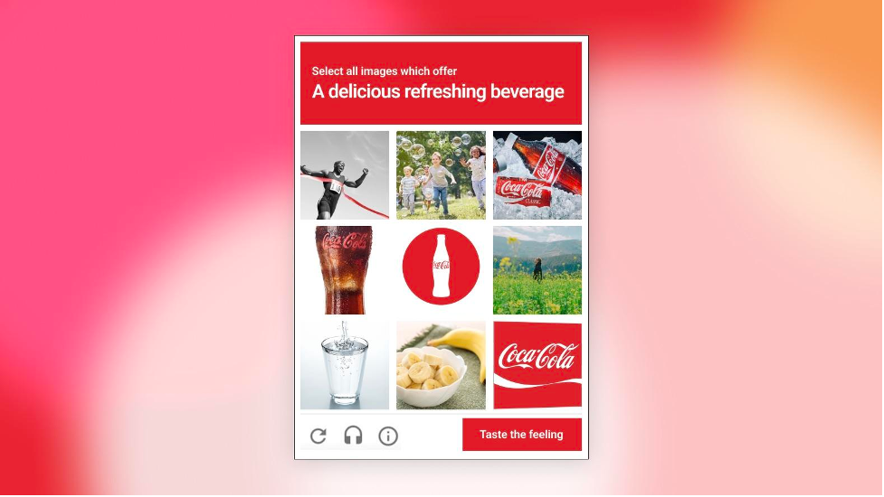
Forms Captcha:
The reCaptcha forms completion. We all love to hate it. But some brands, particularly consumer brands, have turned the obligatory submission request into a fun reinforcement of their brand messaging. Coca-Cola’s unique spin prompts a user to select an “delicious refreshing beverage” aka one of their products from the tile of images rather than unappealing taxi cars.
Kit-Kat goes a step further with an interactive element that asks users to drag a finger across their candy to “Have a break”.
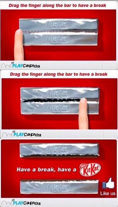
Each of these examples serves to reinforce brand taglines and catch users off-guard with appetizing reminders of their product.
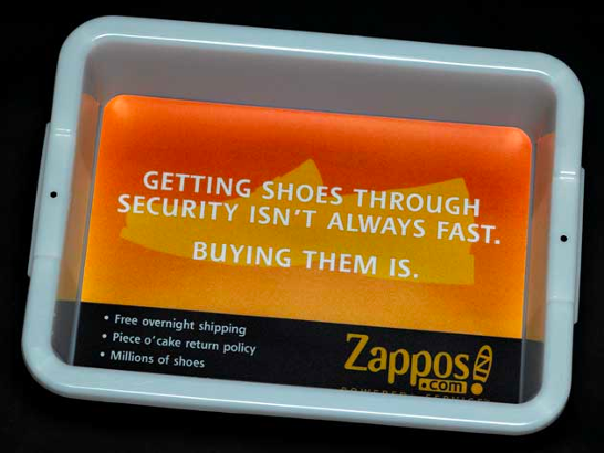
Airport Security Bins:
Again, the premise of scrambling with your shoes and unpacking belongings in a crowded airport security line isn’t everyone’s favorite memory of the vacation. However, branded security bins when they make sense can be a clever way to catch a viewer’s attention and make them smile. Zappos for example takes a comedic spin on the frazzled shoe removal process with a reminder that while tying up your laces may not happen in a flash, their shipping speeds will.
Gas Station Pumps:
Ever been slightly startled by a spontaneous jingle playing at the gas station pump? Yeah, us too. We must admit the logic is there. The viewer is standing face to face with the pump, undoubtedly bored and waiting for their tank to be filled. But alas, their attention is grabbed by a video ad for some product or service they weren’t previously thinking of. It could be powerful, but it could also be perceived as annoying or in these times associated with upward tick of their escalating gas price.
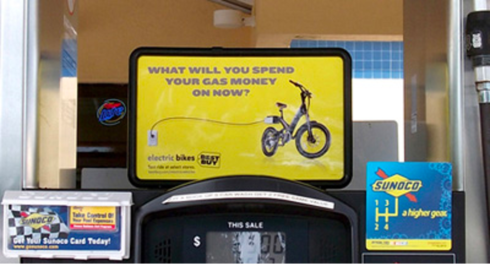
This electric bike example cleverly acknowledges the dread of rising gas prices by promoting a more environmentally friendly option.
Looking to stand out in your marketing activation efforts? Whether that be through out-of-home advertising or digital media avenues, get in touch with Bluetext today to determine the correct media mix given your business goals and budget.
Launching your new or revitalized brand is the most important stage of the rebranding process. You’ve done all the hard work at this point, determining the right look and feel, message, and character for your brand. The crucial next step is to announce yourself to the world, both from an internal and external point of view. In today’s blog post, we’ll cover how to launch your new brand into the market and how to ensure your employees are ready to be your top brand ambassadors.
1. Brand Launches are Non-Linear in the Rebranding Process. Prepare Ahead of Time.
Preparation is the key to success. Without it, you run the risk of reducing the impact of your brand launch. You only get one shot at this so be sure to make the most of it. Begin ideating on how and when to launch your new brand at the start of your rebranding process. You’ll want to have a clear sense of the rationale behind the rebrand and how it impacts the broader narrative you want to communicate to the market. This foundation creates meaning and purpose, giving you a chance to engage with your existing customers and create new ones.
If you wait too long to start planning your brand launch, you risk confusing the market and your employees, leading to increased turnover and a decrease in market share. Be intentional and calculated as you determine the best course of action.
2. Increase Your Market Impact By Properly Determining Your Market
A successful brand launch reaches all notable audiences including both internal and external stakeholders. You’ll want to think strategically about your key audiences and prioritize your brand launch activities accordingly. For example, you may want to provide your high-value clients, key partners, and investors with a personalized introduction to your new brand. Making sure you create a positive trustworthy impression with your key audiences will increase the impact of your launch and the chance of success.
3. Communicate Efficiently, Communicate Effectively
The narrative you bring to the market for your brand launch is the most important aspect of the entire undertaking. Document your communication plan via a spreadsheet to ensure your tactics are on track from a timing and budget standpoint. Think through the most effective channels you can use to communicate the launch of your new brand to your key audiences.
Tactics can and should include: emails teasing the new brand, a pre-launch event for your most strategic audiences, and a landing page for people to visit to understand how the rebrand affects them in the short and long term. An effective communications strategy prepares your customers and investors for what’s to come and creates buzz around the new brand.
Think through a phased approach to your brand launch, utilizing a variety of tactics and channels to create the biggest impression. We’ve said it once and we’ll say it again: you only get one shot at this. Make it count.
When in partnership with Arlington Capital Partners, we launched Centauri. Our team developed and executed an integrated go-to-market strategy including PR, digital advertising, and social media. A key component of this campaign was a series of emails teasing the new logo, message, and brand into the market.
4. Saying Sayonara to Your Old Legacy Brand
While it may be hard to let go of the past and the brand assets that got you to this stage in your company’s lifecycle, you made the decision to rebrand and enter a new phase of growth. Migrating your brand from the old to the new creates consistency in your overarching brand narrative.
Create a brand migration list of all of the places your old brand is visible from both an internal and external view. Your website, building signage, virtual backgrounds, mugs, business cards, ad campaigns, etc. should all be added to the list of touchpoints. Determine what it will take to update each asset and work backward from the items that will take the longest to finalize. Ensuring each of these touchpoints is taken care of prior to your brand launch means minimizing confusion for your key audiences and the market at large.
5. The Key to a Successful Rebrand is Getting Your Internal Stakeholders Onboard
In many senses, your employees are your brand’s most important ambassadors. Getting them to embrace the changes and preach the narrative you’ve created with authenticity will ensure a smoother transition from the old to the new brand. Educate your staff on the brand’s mission, vision, and core values, articulating the direction of the new brand. Provide your employees with your updated brand guidelines, outlining how your brand should look in white papers, PowerPoints, data sheets, etc. Outfit your team in branded swag to make them feel like part of the team and drum up excitement ahead of the brand launch. Your people are your greatest asset; use them to their full potential and reap the benefits.
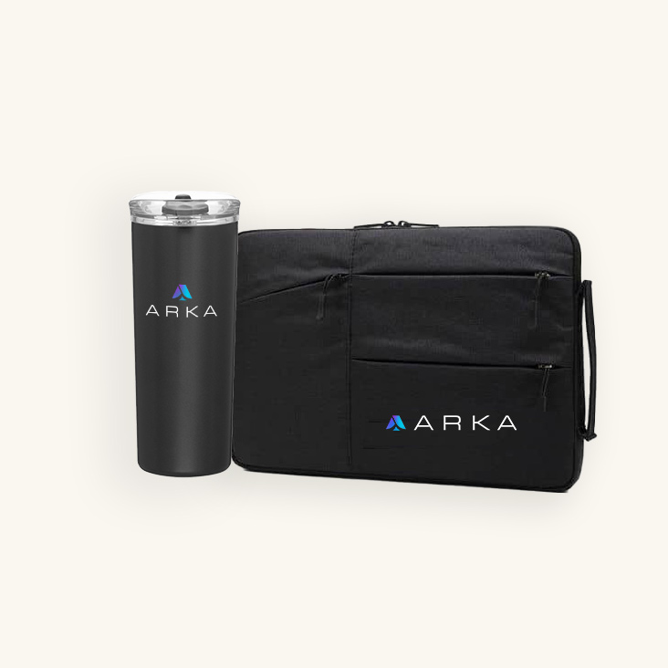
When ARKA came to Bluetext following a merger, they needed new messaging, brand creative, website design, and a brand launch program to unite the legacy companies. As part of the brand launch, our team implemented a full brand ambassador program, email announcements, a central inventory of brand assets, and FAQs. To get employees excited and geared with new brand creative, a ‘Welcome to the Brand’ kit was designed and coordinated to arrive with the announcement of the new logo & brand.
6. Launching Your Brand Externally – Patience is Key
The most important thing to remember for any external brand launch is to be patient. It’s an exciting time; pressure is high and the fruits of your labor over the last few months are about to be realized. Just remember, patience is required to achieve maximum impact, and timing is everything. Coordination is an integral component of your brand launch, ensuring everything launches without a hitch, and no one accidentally jumps the gun by updating their LinkedIn header with a graphic featuring your new logo. Using your brand migration list, execute accordingly, launching your new website, updating social media assets, and distributing press releases. Many brand launches culminate in a public event, where you unveil your new logo, mission, core values, etc.
Following a series of mergers and acquisitions, BigBear.ai came to Bluetext with the goal of creating a new unified brand identity, revamped external messaging, and strategic public relations that would help them stand out in the crowded AI space. As part of the external brand launch, our team designed a jaw-dropping trade show booth experience that brought the spirit of the BigBear.ai brand to life with a 3D video wall. It had event attendees stopping in their tracks.

7. Your Brand Launch is Just the Beginning
You did it! Your brand is officially in the market. While you may have thought this day would never come and it feels like you just crossed the finish line, remember that launching your brand is only the start of the journey. Keep tabs on all ongoing brand development and ensure that any new materials stay within your outlined brand guidelines. Consistency is king and has the power to make or break your new brand. Remember, a brand is a living, breathing organism that requires constant upkeep and preening. Conduct regular brand audits to ensure your brand is working for you and not the other way around.
Is your brand ready for a refresh? Contact us today at Bluetext to learn more about our rebranding services. We work with premier private equity companies, launching updated brands for newly merged or acquired companies into the market and generating massive successes.