When the stars fall smartly into alignment with a new brand, it can elevate the organization to new heights. For Integrity Applications, a government contractor comprised of three of the leading companies in space, intelligence, cyber, the stars became a main focus of the rebrand. It turned to Bluetext to develop a new name, messaging, and brand that would represent the value that it brings to its U.S. government customers in the intelligence and national security community.
The company had several significant challenges that needed to be overcome, the first of which is that it works primarily in a sector where the programs are very sensitive and highly classified. Second, a primary goal for the brand is recruiting a talented team with advanced skills in software engineering as well as all elements of STEM. And third, it needed to stand out as a prime contractor in a crowded field of competitors.
Bluetext employed an extensive discovery and research process that included In-Depth-Interviews (IDIs) with top experts and executives across the company to define the specific attributes that make the organization unique. Our goal was to define what ties together the missions that the company supports. After interviewing senior executives across the organization, we conducted a separate set of IDIs with newly hired recruits to understand what made them choose the company for their careers. The focus on space became a key component in our process. We also talked to a number of veteran employees to understand what made them stay and what was important to their longer-term careers, a crucial component of the new brand story and recruiting materials. Using the results of these interviews together with competitive analyses and additional research, we created a messaging platform that recognizes its strong commitment to space as a key part of its legacy as well as its biggest opportunity for growth.
Employee engagement was a critical element in the process, especially given the competition to attract the best candidates with the technical skills and security clearances required by government customers. Once the new brand was approved, team members across the company were asked to participate in the brand launch through parties, branded clothing, contests, and a variety of other engaging activities. We also created a “Brand Essence” video to help tell the story.
Because of its interest in and focus on space, we also wanted to capture the hopes and vision that space exploration suggests. The result was the new brand Centauri. Centauri, from the star system Alpha Centauri, is the closest star system to Earth. And, like the company, it is composed of the brightest stars in the sky. It also has always been used as a navigation guide throughout history. We believed that because of these associations, Centauri was a great fit for the brand.
Once the name was approved, we turned to the corporate visual identity. Bluetext designed a cutting-edge look and feel for Centauri that sets it apart from the competition. Written in a custom lowercase typeface, the Centauri logo is modern and approachable with a unique icon representing the stars that make up the Centauri constellation. The star pattern around the logo became the basis for texture and patterns across collateral and the website.
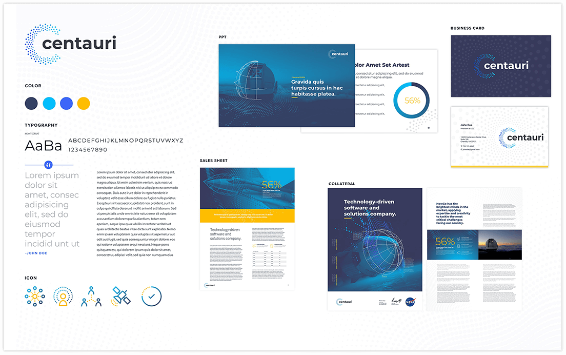
We then turned to the website. Centauri’s new website incorporates all of the brand’s new elements, ensuring consistent brand identity and a strong web presence. Bluetext designed a site and user experience that prioritizes recruitment.

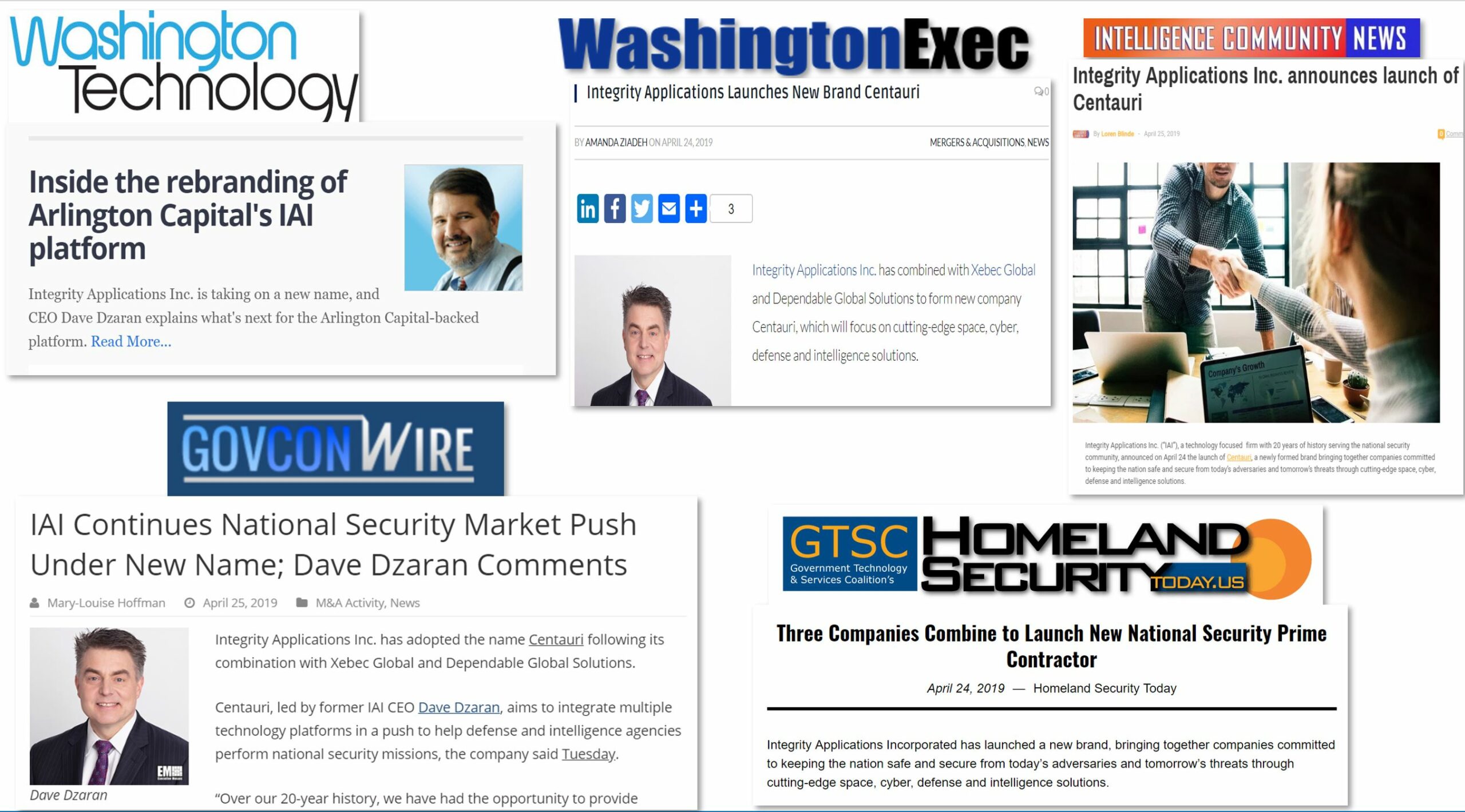
With the brand in place and the website launched, we introduced Centauri to the market through a series of media interviews with key vertical trade publications. Offering details and interviews with CEO Dave Dzaran in advance to key target outlets under an embargo agreement, we were able to shape the initial launch coverage to focus on Centauri’s growth strategy as it continues to acquire new capabilities for its customers.
For Centauri, with the help of Bluetext, the stars aligned for a bright new brand and a successful launch.
Interested in Refreshing Your Company’s Brand? Learn How Bluetext Can Help!
Internet challenges can go viral, for better or for worse. For better, think of the Ice Bucket Challenge of several summers ago that raised millions of dollars for ALS research. For worse, the list is, unfortunately, a lot longer. There’s the Tide Pod Challenge, which has sent dozens of college kids to the emergency room, and more recently there was the Momo Challenge, which scared the wits of countless children who came across it on the internet.

YouTube has scrubbed ALL real video clips of the Tide Pod Challenge
What’s common to all of these is the relationship of the challenges to the brands that have been associated with the viral responses, especially when, like with the Tide Pod dares, it’s not safe and it certainly isn’t supported by Tide! As a result, company marketing and communications teams are struggling with how to respond to these dangerous challenges and encourage their quick cessation. Questions are being raised, in the meantime, about the responsibility of the digital platforms that allow the more dangerous challenges to take hold and the role of digital influencers who are becoming so important to brands in promoting them.
PRWeek’s Chris Daniels recently wrote a front-page article about the topic, “Beyond Momo: Why brands need to get ready for digital hoaxes.” In preparing the article, Chris interviewed Bluetext Creative Director and Co-founder Jason Siegel for insight on how agencies like ours counsel their clients on this dangerous trend.

As Jason told Chris, “When a hoax interacts passively with influencers, dangerous sharing at mass scale occurs.” Jason explained that influencers get deluged with so much information these days that the sheer volume means they may not be taking the time to research the origins of every trend. It is unreasonable to expect them to act as fact-checkers to understand what’s behind every viral moment – especially if it’s a challenge that’s getting traction.
In the PRWeek article, Chris focuses on the Momo challenge, which encouraged kids to do dangerous activities, and he discusses the responsibility of platforms like Google and Facebook.
“Brands need to think about the risk in terms of influencers they engage with and having the hoax interwoven in a paid influencers stream that is shared by many folks,” Jason told Chris.
At the very least, brands need to take a close look at their influencer relationships. They also need to have an “escalation” plan in case a viral challenge takes off, for better for worse.
Need help with your brand influencer strategy? See how Bluetext can help.
No look at top marketing trends would be complete without considering the look and feel of a brand: the colors it uses, how the logo is displayed, and the tone and personality it conveys. They all can play a large role in how it is perceived and received by its target audiences. In Part Five of Top Marketing Trends series, we have identified six key directions to keep an eye out for in 2019 when it comes to the visual identities that brands are moving towards in the market.
- Bold Typography. Look for bigger and bolder designs in 2019. Extra-large font sizes, hefty headlines, and interesting artistic effects will be more common. While sans-serif font types have been a dominating factor in font styles, expect more of those in the Helvetica family, especially the extra-bold variations.
- Authentic Photography. Stock photography is getting old and tired. The same smiling perfect faces in gleaming sterile office settings doesn’t look like anything most audiences can relate to or engage with. Real photography through custom shoots will be in more demand. Images services will meet this demand with more photo libraries of authentic images that convey emotion or tell a story.
- Custom Illustrations. Like with photography, look for more custom illustrations that add personality and a little whimsy to a brand’s website and collateral. Look for more creativity and less formality in a broader range of styles as designers stretch their palette with these underused assets. Classic design techniques such as double-exposures and duotones are both re-emerging as modern trends.
- Movement and Animation. “Microinteractions” are one of the newest directions in brand design, and they are generating a lot of buzz already for 2019. Put simply, these are tiny animations used to help target audiences to perform tasks more simply and easily. These are now being widely used as a key UX design trend, and they are especially helpful in providing feedback for their actions. GIFs and SVGs can convey ideas, concepts, and processes, while making content engaging for audiences. They add more interest to emails, banner ads, social media, and even icons and logos.
- Gradients. The use of gradients by a brand was visible on every website button, page header, and PowerPoint deck in the earlier days of digital marketing. That all changed in favor of more flat designs; you can follow the history of the Google logo for a true chronology of this trend. But gradients are back, so expect to see them in vibrant branding, illustrations, and backgrounds as well as overlays. We’re also seeing an increased use of the term “color transitions” when referring to gradients.
- Responsive Logos. Our top marketing trend for 2019 is around a brand’s logo. Responsive techniques for website design came on slowly, but they have more recently become a best practice and an industry standard. With mobile accounting for a greater and greater share of online traffic, it’s no surprise that brands need better ways to show off their logos even on small screens. Applying responsive designs to logos is the next step in this process. Look for this as a major brand trend in 2019.
Learn how Bluetext can help you make the most of the top marketing trends for 2019.
Choosing a new name for a brand or a product is never easy. This is particularly true for companies that, through private equity acquisitions and spin-offs or other M&A activity, find themselves needing to quickly find a new name to separate them from their past affiliation. But finding a name that is original and conveys the right tone and attributes is difficult. Add to that the requirement that a URL be available, and it becomes seemingly impossible. Yet, as top branding agencies know, finding a strong new name can help launch a new brand that gets noticed, or re-ignite an old brand that is need of a new direction. What it takes is a proven and disciplined approach.
Finding the right name is hardly a new problem. Ford Motor Company notoriously faced this issue in the mid-1950s when launching a new line of vehicles into the U.S. market. Recently retold in an article in The New Yorker magazine, Ford searched long and hard to find a name for its newest car, even turning to a poet for help. She came up with a long list of suggestions that didn’t sound like a car, including the Intelligent Bullet, the Ford Fabergé, the Mongoose Civique, the Bullet Cloisoné and (my favorite) the Utopian Turtletop. Instead, Ford chose to name the car after the founder’s son and called it the Edsel. It went on to become one of the most notorious failures in automotive history.
Would a better naming strategy save the car from its ignominious demise? Maybe not, because the vehicle had other issues that didn’t resonate very well with consumers.
Flash forward 60 years, and the name challenge is even more difficult, with the modern twist of the proliferation of URL “squatters” that buy up every word combination in the hope that they can sell it at a profit, making it nearly impossible to find an available word without paying a fortune for the domain. Today, bad naming decisions still plague the corporate world. Earlier this year, the Tribune Publishing Company, owners of the Los Angeles Times and Chicago Tribune among other papers, decided to rebrand itself as a content company and chose the name Tronc, short for Tribune Online Content. The name was not well-received in the market, and the company has since put itself up for sale (and has seen a half-billion-dollar sale to Gannett fall through). Any branding professional would have seen that coming.
Why? First and foremost, because it’s an ugly sound, that’s a key criterion for a new name. As The New Yorker article points out, there is lots of research about how people respond to words and sounds. So, for example, front-vowel sounds – ones that are formed in the front of the mouth like the “i” in “mil” – evoke “smallness and lightness.” Those that come from the back of the mouth, such as the “a” in “mal,” emote “heaviness and bigness.” Softer consonants, like “s” and “z,” seem lighter than so-called “stop consonants,” like “k” and “b,” which seem weightier. When George Eastman invented the name Kodak in 1888, he did so because he liked that “k” was “a strong, incisive sort of letter.”
Bluetext’s Four Pillars of a Good Name
We’ve developed our own four naming pillars that we strive to meet when working with our clients. We believe that a new name should:
* Be easy to say
* Be easy to spell
* Be easy to remember, and
* Most important, Tell a story
We know that hitting all four of those elements is not always possible, especially as URL and trademark issues often require the use or words purposely misspelled, like the car service Lyft. Tronc fails on several fronts. It doesn’t tell a story about the brand, nor is it obvious on how it should be spelled. As The New Yorker puts it, “Tronc wants to seem light, fast, forward-looking, and unburdened by the media industry’s past, but its back-vowel sound and its leaden ‘k’ ending sonically convey something heavy, slow, and dull.”
Real words when used as names need to make a connection between the underlying meaning and the brand itself. So, for example, Tesla was a genius on the cutting-edge of innovation. Bluetext is the color that text turns when hyperlinked in a document, and thus is the window to the digital world. Made-up names don’t always have this connection, and thus need to rely on the root syllables and sound for their meanings. Lexus suggests luxury, Viagra both vitality and virility. Inspirata, a medical analytics company we recently helped to brand, suggests inspired data.
Names are the first exposure that key target audiences have to the brand or product, and need to be carefully thought out. A disciplined process for evaluating the key messages, the nature of the audiences, the competitive landscape and what that brand aspires to be in two-to-four years all need to be part of the process.
ManTech, a multi-billion-dollar public company that provides technology services to the U.S. government, had the challenge to elevate its online presence and continue its competitive position in the crowded Federal government marketplace. To achieve its goal, ManTech selected Bluetext to take its brand to the next level and transform its online presence – all to meet tight deadlines in less than 6 months.
Bluetext designed a fresh, bold look and feel that embodies ManTech’s cutting-edge capabilities and sets the company apart within its industry. The designs and collateral made thoughtful use of ManTech’s color palette, balancing the brand’s vibrant red tones with whitespace. The use of dynamic motion throughout the visual identity showcases ManTech’s innovation and adaptability, always moving forward to meet the evolving technological needs of the government.
Part of the project included a new website. ManTech and Bluetext worked together to design, architect, and develop a fully responsive site with an enhanced user experience. The intuitive, well-organized design drives users to their needs quickly and functions as a lead-generation tool. The new site also provides a new experience to recruits with a seamless integration of job application workflow, allowing prospects to quickly search and filter jobs relevant to their specific interests and experience.
The site was built on a Drupal 8 CMS platform to provide the flexibility and scalability the large enterprise needs to support its digital marketing initiatives. The team conducted a comprehensive content overhaul and developed a strategic SEO plan to make ManTech.com an organic SEO over-achiever. The ManTech marketing team is now empowered to “own” its digital platform and market to its users, no longer requiring the involvement of the development team.
One of the key aspects that sets ManTech’s new site apart is the use of motion. As one of the final components of the project, Bluetext produced a series of videos for the website, weaving ManTech’s suite of capabilities into one cohesive and powerful story. These videos highlight ManTech’s mission-driven brand while educating potential customers on its world-class solutions.
Click here to see more examples of the ManTech project, or learn how Bluetext can help your organization elevate its brand and online presence.
What’s the real value of a logo fight? For most emerging brands, that answer is never obvious. Logos are never static designs, and revising it, or changing it all together, is often an option. But what if that logo belongs to one of the top tennis professionals, and he loses control over it because of a contract he signed when he was still an emerging brand, long before his current fame?
That’s exactly what’s happening to Roger Federer, a twenty-time grand slam winner for whom his initials have defined an era of tennis competition around the world. Federer, who is still recognized as one of the best players of all time, is an iconic sports figure around the globe. Because of his fame and success on the courts, his brand is also one of the most valuable in the market for tennis and other apparel and merchandise, and his logo fight makes sense.
Unfortunately, as the sports world is now learning, Federer doesn’t own the rights to his logo, even though it is comprised of his initials, RF! Early in his career—before he had achieved his global notoriety as a tennis phenomenon—he signed a deal with Nike that gave it the rights to his logo. That might have seemed ok at the time—after all, the deal with Nike was worth tens of millions of dollars over his career.
But just recently, he decided to end his 24-year partnership with Nike, and has switched to the Japanese manufacturer Uniqlo. I’m sure they cut him a massive deal, but it didn’t allow him to migrate his famous logo. That belongs to Nike, and that’s where the logo fight now stands. Here’s the history:
In 2003, when Federer was just emerging as a tennis superstar, his wife and her father developed the RF logo specifically for a perfume with his name on it. Federal liked the look of the logo so much that he talked with Nike about creating a marketing strategy around the initials. It made its first appearance on his 2006 Wimbledon blazer. The rest is logo and brand history.
The problem is, Nike is claiming ownership of the logo even with his move to the Uniqlo brand. And legal observers say the claim is solid. Federer is clearly not happy with this development. Here’s what the Swiss superstar told one reporter recently:
“The RF logo is with Nike at the moment, but it will come to me at some point. I hope rather sooner than later that Nike can be nice and helpful in the process to bring it over to me. It’s also something that was very important for me, for the fans really. Look, it’s the process. But the good news is that it will come with me at one point.”
That might be wishful thinking, and he may be trying to play nice in the hope that Nike executives will have pity on him. But I wouldn’t be so sure. Nike has no incentive to help a competitor take revenue from a product line and brand that it invested time and resources to build. The answer may play out in court, just not a tennis court.
The lesson here is pretty simple: Protect your logo and brand trademark from day one. Make sure your company has complete control over its use and its future, and don’t sign that away to a partner. It’s one of any brand’s most valuable assets, and needs to be treated that way.
Want to develop your brand and logo strategy? Find out how Bluetext can help.
When Finite State, one of the hottest new start-ups in the cybersecurity market needed a strong visual identity and a website for its launch at Black Hat this year, it turned to Bluetext. Finite State has the first comprehensive and proactive cyber solution to the growth of IoT, which has quickly become a significant security challenge across enterprise networks. Bluetext developed a graphic approach that draws themes and connections across the business landscape, and a new website approach that educates the audience on the IoT threat while differentiating Finite State’s solution for the market.
It’s always rewarding to see a client do well and continue to grow in their market. It’s doubly exciting when two clients team up together to build a powerhouse brand. That’s exactly what has happened with CQRoll Call, one of the best-known and most widely-respected publishers of both policy content and advocacy tools, was recently acquired by FiscalNote, a Google-backed player in the governmental affairs and advocacy that has grown into a data-driven, global player and has expanded into digital advocacy and issues management.
The partnership takes advantage of CQ Roll Call’s rich history of unbiased coverage of the Federal government and FiscalNote’s expertise in technology and real-time policy data and analytics to provide a broader suite of products and services in a dynamic market. The acquisition allows both brands to identify new opportunities to adapt and grow in the digital news landscape.
CQ Roll Call chose Bluetext to design a new website for its wide selection of both policy information and advocacy platforms in order to better attract and convert target prospects into customers. We developed an approach that allows visitors to quickly self-select what they are looking for on the website and gets them to those software options with in-depth product information and pricing.
For FiscalNote, Bluetext designed a new approach for its brand and website to simplify the user experience, delivering the right content and information to prospective customers to understand the best options for leading advocacy campaigns in today’s digital age.
For both brands, Bluetext was able to take them to the next level in terms of their position in the market, transforming them into cutting-edge industry players.
The end result: A strategic acquisition that makes the new combined powerhouse brand the market leader both in the U.S. and globally.
In the world of digital business, it’s essential to stay up to date on the newest trends in branding and marketing to ensure your business remains an innovation frontrunner.
One increasingly powerful trend in the online world is the advent of motion design. Having already leveraged much of the potential of static image design and looking forwards towards new possibilities, many businesses are adding motion to their social feeds, their marketing and their branding.
While video and motion now dominate the fields of social media and marketing, most companies still rely on static logos for branding, making now the perfect time to stay ahead of the game with inventive motion branding.
The Benefits of Motion Branding
Your logo is an essential part of your brand and in many ways should attempt to distill everything your brand is about into one memorable graphic.
This in mind, moving from a still image to a creative motion graphic is a big change and will have wide-reaching reverberations that affect how your customers perceive and interface with your business.
Taking advantage of creative motion in branding is an ambitious and rewarding choice that comes with a number of attractive perks.
-
Tell a Story
Adding creative motion to your branding creates new possibilities for dynamic storytelling.
With static image logos, what you see is all you get. This is inherently limiting when it comes to telling a story. With creative motion branding, however, you introduce the possibility for progression and change into your branding, allowing you to tell a more complex story.
Telling a better, more fluid story can help you connect with potential customers on an emotional level which is critical for attracting their business. In fact, neuroscientists have found that people generally make their decisions based more on emotions than logical thinking, meaning that more robust storytelling is a surefire way to outdo competitors.
-
Raise Brand Awareness
Leveraging creative motion in video is an especially powerful tool for raising awareness of your brand.
Creative motion provides new opportunities to make your logo unique and engaging which reflects positively on and raises interest in your brand. When someone encounters an animated logo, they are a lot more likely to remember it and share it than they are with the static logos they are used to seeing.
Raising brand awareness is great for business. One cross-industry study, for instance, found that raising brand awareness has a significant impact on market performance.
-
Stand out from the Crowd
No matter where potential customers are encountering your branding, it’s sure to be surrounded by a variety of different static objects or images with which it has to compete for attention. This is true on social media, while browsing the web, on mobile, or even out in the real world.
Integrating creative motion into your branding guarantees that it doesn’t fade into the background, and instead leaps out at your potential customer in stark contrast to the static environment around them.
Before your customers can raise awareness about your brand, they first need to recognize it. Creative motion branding ensures that your logo will capture people’s attention and prevent potential customers from scrolling, clicking, or walking right by without a second glance.
Using animated branding is a surefire strategy for spreading awareness of your unique brand and story. Though static images sometimes do the trick, they rarely can compare to a dynamic logo that catches your potential customers’ attention all while enriching your brand story with exciting new detail.
| Learn how Bluetext can get results for your digital marketing campaigns. |
We’re now halfway through the year and it’s time to check in on some of the top digital marketing trends that we’re seeing for the second half of 2018. The past two years have seen a near-universal transition to digital marketing strategies being implemented across every industry. A digital approach to marketing is now a given. It’s now more a question of which tactics and strategies companies are going to follow to get the best messages in front of the right audiences, how they will measure those programs, and how they will manage the results. With that in mind, here is what we are seeing in the market here at the half-way point.
- Analytics is Everything. There’s an old saying in marketing: If you can’t measure it, you can’t manage it. In previous eras, measuring wasn’t so easy, particularly with online outreach and strategies. Today, that’s no longer a viable excuse, and top marketing agencies (like Bluetext) will be held accountable for results through analytics. That’s good news because when done correctly, marketing analytics tell you at every step how the campaign is performing. That allows us to revise and optimize campaigns in real time – for example, abandoning creative that isn’t performing as well as other themes. If your agency isn’t proactively incorporating analytics into their programs, it’s time to find a new agency.
- Video is Now the Norm. A report by Cisco demonstrates that video marketing continues to increase as an essential component to digital marketing campaigns. Cisco predicts that by the end of 2019, more than 82 percent of online marketing campaigns will include video. There’s a reason for this: Video is compelling and engaging, exactly what brands want to attract new customers. We’re already seeing this across social media platforms. But here’s the catch – it needs to enhance the experience, not get in the way. Too heavy a load time will drive customers away.
- It’s All About the Mobile. As the march of demographics moves on, a larger percentage of the workforce will be relying on their mobile screens for their first interaction with a brand. At Bluetext, we create mobile screens right alongside our desktop versions so clients can see and approve the mobile versions. This is significant for search engine optimization, as Google will continue to evolve its algorithms to reward websites that are mobile-optimized – punish those that aren’t.
- What Happened to Virtual Reality? We love virtual reality as a key tool in digital marketing and have created a variety of very cool and effective VR experiences for our clients. But not everyone has seen the light on VR, and it simply hasn’t caught on with consumers the way many of us hoped it might. But there is a glimmer of light at the end of the tunnel… with augmented reality. Apple’s ARKit for app developers is poised to make the delivery of augmented reality much more consumable for marketing.
- Blockchain Could be a Game-Changer. One of the hesitations we see with digital marketing revolves around the delivery of online ads, whether they are banner or social media. Part of the problem is measuring their delivering to the right target audiences at the right time. Even with the best analytics installed across a campaign, we can still only measure end results; it is difficult to verify which ads are delivered to which targets, and what they do when they see those ads. That is changing with blockchain technology. Blockchain can give us real verification on campaigns while protecting against over-serving ads and ensuring that bots aren’t pretending to be influencers.