Over the last couple of years, Bluetext has noticed a few key trends in what the C-Suite is asking for when kicking off a website project. Even if they don’t know much about what they’re asking for, or how to accomplish it, they have a keen sense of its importance. “Our competitors are doing it. Companies that we look up to are doing it. We need to do it too.”
Let us break down the 7 most common “needs”.
1. “We need to be seen as thought leaders.”
More and more, valuable website real estate is being dedicated to highlighting thought leadership content. Thought leadership is common on home pages and primary navigation items, especially as increased velocity benefits SEO. Blogs and other educational content are frequently cross-promoted throughout sites. Often, this content is displayed dynamically with custom logic based on publishing dates and category tags to keep pages current and relevant, and require less upkeep for page editing. Our clients recognize that users have come to expect this content, eager to consume and share.
When Bluetext launched the Arlington Capital Partners-backed Centauri, we designed and developed a fully integrated content marketing program to establish the brand in the market and increase word-of-mouth around the launch, prioritizing recruitment and a strong web presence.

2. “We need to tell our story.”
We have moved on from verbose descriptions of who we are and what we do in a home page. Users do not want to read; they want to experience. Today, companies are using “digital storytell” to express their value proposition. Visually stimulating, thought-provoking, and often interactive, digital storytelling creates an experience for the user unique to your company that holds attention to get a message across. Top digital marketing agencies like to think of digital storytell like those chicken nuggets with a secret serving of vegetables inside. The consumer enjoys what they’re eating, but you’re giving them what they need at the same time.
Take for example our work with Invictus. Invictus is a full-spectrum cyber technology and national security company dedicated to the protection of the nation’s security, global defense, and IT infrastructure. Invictus turned to Bluetext to embark on their next mission: grow from veteran-owned small business to big-time government contractor. With a fresh logo, reimagined corporate visual identity, and a modern website, Invictus is prepared to continue growth as a cyber-forward contractor for the federal government and commercial clients.
3. “We need to trim the fat.”
Less is more when it comes to content and choices. Users quickly get lost in antiquated sites with brochure-ware pages and deep menus. Content marketing agencies constantly hear from clients over how bloated their websites have become over time, and seek expert advice to tame its unruly junk drawers. A top digital marketing firm will tell you simplified information architecture can go a long way. Clear personas and usability testing can inform this crucial spout from which content strategy flows. Content should always be filtered for necessity, validated by the persona it serves, hole it fills, and value it adds. As attention spans wane, so must content.
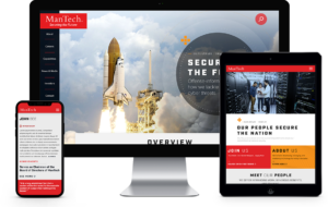
Bluetext partnered with ManTech, a multi-billion-dollar public company that provides subcontracted technological services to the US government, to develop a fully responsive site with an enhanced user-experience. The intuitive, well-organized design drives users to their needs quickly and functions as a lead-generation tool. The new site also provides a new experience to recruits with a seamless integration of job application workflow, allowing prospects to quickly search and filter jobs relevant to their specific interests and experience.
4. “We need to personalize the experience.”
Personalization is no longer reserved for B2C websites. The B2B sales cycle is long, often requiring many interactions and engagements over time. Repeat users are an opportunity to speak on a more personal level. The more data we capture about a user, where they come from, how and with what they interact, the more we can adjust a web experience. From imagery, messaging, journeys, iterative forms, and specific calls to action, personalization lets the user know you understand them. Personalization is not a ‘set it and forget it’ initiative. It requires technology, data, and iterative support over time, making it a daunting undertaking but one with a huge potential for return.
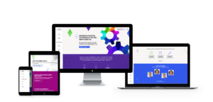
When we partnered with the Graduate Management Admission Council, we re-designed their microsite, CallingAllOptimists.com. Through collaborative field studies and research, Bluetext engineered a unique digital experience in the form of a personalized 4-question quiz. The quiz seamlessly guided the user to customized messaging and content based on their answers, while simultaneously gathering actionable user-insight which integrated directly to GMAC’s marketing automation platform. Not only did this redesign improve the campaign’s functionality and awareness – it created a holistic brand ecosystem that drove both the user and the client to their desired goal.
5. “We need to stand out.”
Ultimately, every brand wants to look cool. Every B2B company wants people to land on their site and think, “wow.” The very first thing a user takes in is the design. As a top digital design agency, we are constantly asked to be innovative and deliver a unique design unmatched by competitors. Bluetext often creates custom animations, illustrations, fonts, menus, forms, and imagery for clients. It’s critical that, while we can wander far from inside the box, we remain true to the brand. The balance of brand consistency and digital creativity can create the award-winning masterpiece many of our clients are after.
When Bluetext partnered with Varonis, we launched the eye-catching “Exposure” advertising campaign, targeting C-Level executives who are unaware of the potential risk they are placing on their enterprises by not leveraging solutions to understand who has access to the unstructured and human-generated data that their enterprise relies on.

6. “We need to cover our…selves.”
The legal landscape of the web is constantly changing. From data protection to inclusiveness, the C-Suite is recognizing the need for compliance to sleep easy at night. Beyond legal safety, these new requirements should be pursued because these rights aim to protect end-users. Digital marketers have a responsibility to make the internet a space for all users to experience equal comfort and access. From 508 to GDPR, your digital marketing agency should proactively implement these requirements as guided by your legal team.
Take for example our work with Level Access. When the SSB Bart Group, the leading provider of accessibility solutions and software, needed a new brand to increase its market share and continue on its growth trajectory, it chose Bluetext to deliver a new name, brand and website that would focus on its people and expertise. The new look and feel and how it is presented on the website reflects Level Access’ mission “to create a world where digital systems can be made readily accessible to users with disabilities—enabling digital technology to become a profound empowering force in their lives.”
7. “We need to harness the full potential of our website.”
Websites have become full-fledged marketing and sales tools. One piece of a 360-degree user experience, websites are now a living, breathing, asset, working in tandem with other channels. Data should consistently inform website governance decisions and data from the website should be analyzed to inform other channels inversely. From tracking to chatting, integrations that connect websites to other marketing channels can exponentially augment what we know about our users. Our clients constantly ask how we can integrate with full-funnel efforts, from hosting events online to chatting with prospects in other languages, the potential is near limitless.
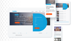
When Bluetext worked with ResMan, a property management platform, to invigorate their brand and redesign their website. ResMan charged Bluetext with repackaging their solutions into a strategic grouping that reflected the market’s needs. As a customer-centric brand, ResMan needed their external messaging and marketing efforts to reflect their goals as a company. Bluetext turned this request into a fully redesigned website, focusing on an enhanced UX that guides ResMan’s users through the site with an intuitive website flow.
All of these “needs” are important to consider, but it’s tough to nail them yourself unless you have unlimited time and budget. An experienced website design and UX agency, such as Bluetext, should guide you through these conversations when beginning a website project to determine what makes sense for your business’ goals and resources. At Bluetext, our goal is that one day a CMO will point to your website in a project kickoff as the bar for their “needs.”
When it comes to building or remodeling your company’s website, partnering with a top website design firm is essential. By hiring a leading website design firm, you get to work directly with experts, maximize the utility of your team’s resources, get access to the latest technology, and so much more. Having a professional, user-friendly website can make all the difference when it comes to acquiring new clients and retaining old ones. Prospective customers will appreciate an enhanced user experience and will be reassured by the legitimacy of your company. Read Bluetext’s top 4 reasons to work with an expert website design firm.
1. Make a Lasting First Impression
At Bluetext, each website we build or remodel goes through a strict quality assurance process to ensure every page functions properly and looks perfect. Our team of coders, developers, and designers evaluate both the UI and UX of the site, validate all links and forms within the site, and ensure that each page follows brand guidelines – but that’s just to name a few of the steps in our process.
When it comes to your website, we know that first impressions are incredibly important. In fact, it only takes users 50 milliseconds to form an opinion on your website and decide if they will stay or leave. Not to mention, over 35% of users will leave a website if they find it unattractive. With a leading web agency, you can rest assured that your website will not only look good but is also easy to use.

2. Optimize Your Website’s Loading Speed
One of the most essential ways to make a positive first impression on users is by having a website that loads quickly. As a website design firm, our team of web analysts will assist with file compression and code optimization, enhance time to first byte, evaluate HTTP requests, and everything else in between, ensuring that your site loads as fast as possible.
About half of web users expect websites to load in less than two seconds and will leave if a website takes any longer than three. If your website drives $100,000 in revenue per day, increasing your loading speed by one second could help increase your daily revenue by 7%. A leading web agency will ensure that no potential customers are lost due to site speed.
3. Ensure Your Site’s Accessibility
At Bluetext, all engagements go through our team of accessibility experts to ensure you are publishing in compliance with the newest WCAG AAA standards. With well over half of the world on the internet, it’s vital to ensure that there are no barriers to access your website for individuals with any disability.
4. Create a Successful Campaign
Through different channels such as social media, mobile applications, search engines, and display networks, businesses can get their names in front of countless users. Meeting the ever-changing requirements of those channels, however, has become increasingly difficult. Not to mention, most every country has different advertising requirements, adding another layer of complication for those interested in advertising outside of the United States.
A website design firm, like Bluetext, can not only help you run global ad campaigns but can help you build the perfect landing page for users to see when they click on your ads.

If you’re looking to hire a leading web agency, see what Bluetext can do for you.
What’s the real value of a logo fight? For most emerging brands, that answer is never obvious. Logos are never static designs, and revising it, or changing it all together, is often an option. But what if that logo belongs to one of the top tennis professionals, and he loses control over it because of a contract he signed when he was still an emerging brand, long before his current fame?
That’s exactly what’s happening to Roger Federer, a twenty-time grand slam winner for whom his initials have defined an era of tennis competition around the world. Federer, who is still recognized as one of the best players of all time, is an iconic sports figure around the globe. Because of his fame and success on the courts, his brand is also one of the most valuable in the market for tennis and other apparel and merchandise, and his logo fight makes sense.
Unfortunately, as the sports world is now learning, Federer doesn’t own the rights to his logo, even though it is comprised of his initials, RF! Early in his career—before he had achieved his global notoriety as a tennis phenomenon—he signed a deal with Nike that gave it the rights to his logo. That might have seemed ok at the time—after all, the deal with Nike was worth tens of millions of dollars over his career.
But just recently, he decided to end his 24-year partnership with Nike, and has switched to the Japanese manufacturer Uniqlo. I’m sure they cut him a massive deal, but it didn’t allow him to migrate his famous logo. That belongs to Nike, and that’s where the logo fight now stands. Here’s the history:
In 2003, when Federer was just emerging as a tennis superstar, his wife and her father developed the RF logo specifically for a perfume with his name on it. Federal liked the look of the logo so much that he talked with Nike about creating a marketing strategy around the initials. It made its first appearance on his 2006 Wimbledon blazer. The rest is logo and brand history.
The problem is, Nike is claiming ownership of the logo even with his move to the Uniqlo brand. And legal observers say the claim is solid. Federer is clearly not happy with this development. Here’s what the Swiss superstar told one reporter recently:
“The RF logo is with Nike at the moment, but it will come to me at some point. I hope rather sooner than later that Nike can be nice and helpful in the process to bring it over to me. It’s also something that was very important for me, for the fans really. Look, it’s the process. But the good news is that it will come with me at one point.”
That might be wishful thinking, and he may be trying to play nice in the hope that Nike executives will have pity on him. But I wouldn’t be so sure. Nike has no incentive to help a competitor take revenue from a product line and brand that it invested time and resources to build. The answer may play out in court, just not a tennis court.
The lesson here is pretty simple: Protect your logo and brand trademark from day one. Make sure your company has complete control over its use and its future, and don’t sign that away to a partner. It’s one of any brand’s most valuable assets, and needs to be treated that way.
Want to develop your brand and logo strategy? Find out how Bluetext can help.
The Bluetext Blog has been focusing on website design for the best user experience. In this post, we are examining five trends that companies need to understand as they examine the performance of their website design and whether it is delivering a successful user experience that is delivering results for the brand.
Cards are Taking Over. Card first became popular in consumer-focused social sharing sites such as Pinterest and Facebook for placing clusters of information – including text, photos, and links relating to one topic – in one place. For 2018, they are already gaining in popularity and offer a visually appealing way to organize and display larger data content in a smaller space. Cards also allow visitors to quickly assess the category of information and decide immediately whether they want to click on it or not. They are easy to manage and companies can select different arrangements and sizes to emphasize some types of content over others. Because of this obvious advantage, particularly on a smaller screen, cards are moving into the mainstream across all platforms.
Don’t neglect the touch. Mobile devices are physical objects that hit a number of our senses, most prominently sight and sound. But the feel is also important, and shouldn’t be neglected. Because of the small size of the screen, giving haptic feedback can be important and enhance the small-screen experience. Adding in well-tuned clicks as the viewer advances through a screen or a list of items also improves engagement. This is particularly true for sliders and similar types of horizontal navigation that takes viewers away from the downward scroll.
The sound and the fury. Some designers feel like sound should be an afterthought, and many find the auto-play functions that are so popular across Facebook and other social meid platforms more annoying than helpful. But when done right, sound layers will enhance the web design user experience on mobile devices. Subtle but pleasant sound layers can signal when a visitor is on the right page and can reinforce the buyer’s journey through the site. They can also add to the experience when a comment is placed, or even an emoji selected.
Video is replacing static images. We all know the appeal of video for communicating information about the brand and its products or services. As video and streaming capabilities continue to get more robust, and as screens themselves better display high-res video, it is quickly supplanting static images on mobile devices. It also better engages customers – after all, video clips are always visually more appealing than static images.
Colors and borderless display. As mobile screens, now including the Apple iPhone X, are moving their screens to be completely borderless, maximizing that display field is essential. To do that, vibrant colors are making a comeback. It was not too long ago that the trend was for muted and pale color combinations to accommodate the flat designs of mobile devices. Not only do more vibrant colors attract user attention, when used in combination with the borderless display, they allow website design to literally go outside the lines for a better user experience.
Annual trade shows are often the biggest events of the year for brands hoping to make connections, network with players across their industry, identify new solutions for their business, and generate solid sales leads. The Bluetext team has vast experience with association conferences and trade shows, generating attention for our clients, arranging media interviews and coverage, crafting the creative approach for their floor space, and publicizing their successes.
For our trade association clients, we work with them to help market their shows, growing their attendance and revenues through sophisticated, multi-platform outreach campaigns. One of our premier clients, the National Retail Federal (known as NRF), has been holding The Big Show for more than a century. We have worked with NRF for several years, starting with its Big Show for 2017 and this week attended NRF 2018 in New York City to see how it came off.


The theme this year is “Transformation,” and speaker topics centered around the retail industry’s need to transform itself in the wake of the digital revolution in retail sales. We developed the creative approach for the show and the marketing activities generating attendance. It is the retail industry’s largest annual gathering, and as the agency partner responsible for generating registrations and revenue, we are proud to say that this year, the show attendance was bigger than ever – and exceeded NRF’s registration and attendance goals.
As part of the creative approach to this year’s event, Bluetext created a “Transformation Ribbon” of deep red that can fold and unfold with digital GIF video that works across the show website, and through static images on emails and signs. For The Big Show itself, we designed a three-dimensional version that would pop among the attendees at the Jacob Javitz Center in New York City.
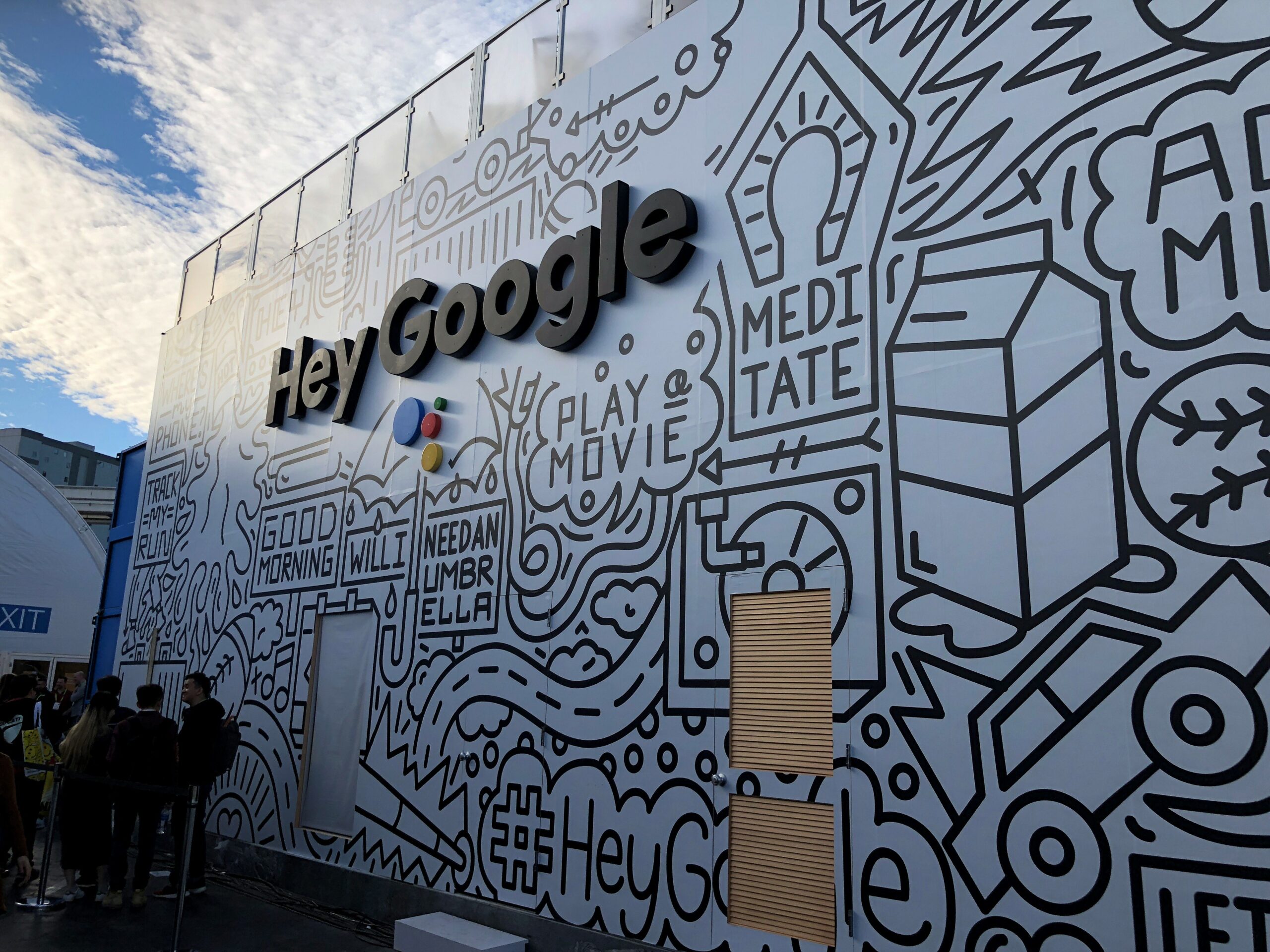
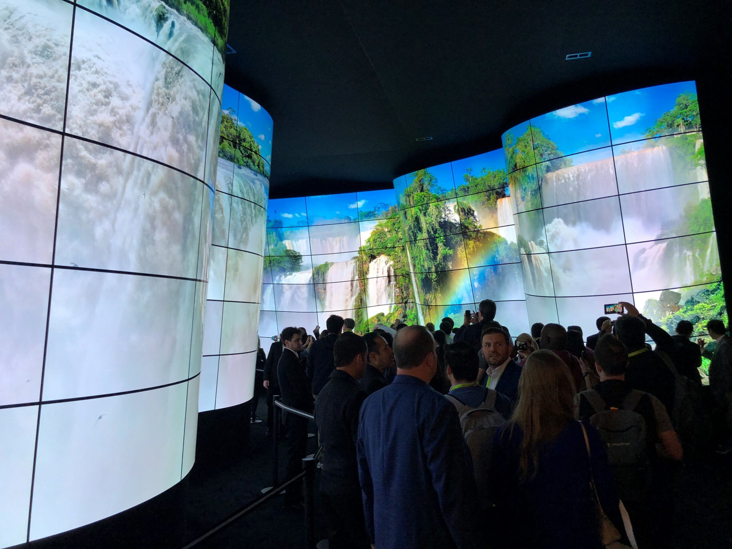
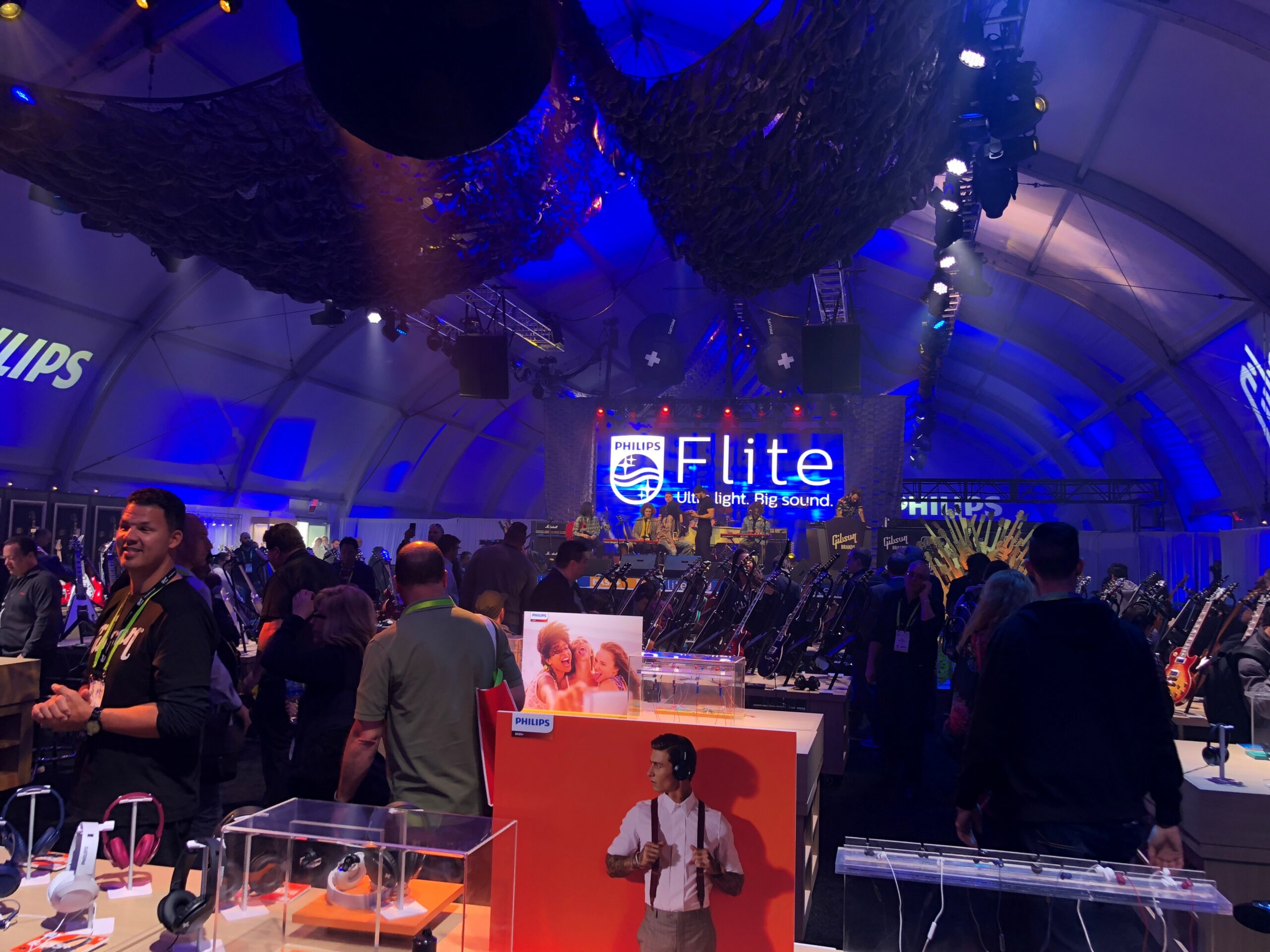
On the other side of the continent, Las Vegas played host to the annual Consumer Electronics Show, which is a massive gathering of the industry to show off the latest electronic devices, ranging from big screen TVs to driverless cars to commercial and hobby drone to everything in-between. The Bluetext team was there to help several of our clients reach new audiences and get attention for their products and solutions. The one thing to say about CES is that it’s cool, and that was most evident in the variety of new consumer electronics that was on display.
Looking to make a splash at your next Industry Trade Show? Find out how Bluetext can help.
B2B website design that focuses on the user experience will continue to be a top priority for brands who thought UX was only for consumer and e-commerce sites. In a recent blog post, we offered some of the best practices for developing an effective user experience on a business-oriented website. In this post, we will explore some additional best practices for the B2B website design that puts the user first in its architecture.
Write the way your targets think. When potential buyers visit your website, they will have a level of knowledge that most often is not as deep as you. Write content for who they think and eliminate jargon or text that won’t keep their attention. Use language, phrases, and concepts that are more likely to be familiar to them.
Make sure the text you include on your site appears in a logical order, but it should be natural as well. Confer with key customers and ask them to describe what your solution, services or products mean to them. What problems do they solve, and what were their pain points before working with you?
Let the buyer maintain control. Eliminate designs that override how a prospect might want to interact with the website. Autoplay videos, which have become ubiquitous across social media platforms and many news websites, can frustrate visitors who view these are a nuisance.
Don’t assume what the visitors want to do; let them play the video only if they want to. It should supplement, not be a substitution for, good content that is in text on the page.
Automatic carousels, once a common feature on many high-end websites, have also lost their allure, for the simple reason that they don’t work. Besides the fact that motion in carousels is distracting and rarely timed at the right intervals, it doesn’t present key messages to the visitor where they will be certain to see all of them. Layer information for your website in a way that makes it easy for your buyers to discover and explore instead of using an element that is less effective.
See how Bluetext can help your brand deliver an effective user experience.
In the avalanche of 2018 predictions for marketing teams, one that should be among the top is the need for B2B user experience website design. In the consumer sphere, user experience has a big headstart. On the B2B side of the equation, getting buyers to convert on the website takes much more information. It’s more likely you are going to explain a lot to get your buyers to convert into customers.
The higher and more complex the value of what you are selling, the more questions you will need to answer throughout your site. That makes information architecture essential to the success of the website, and a step in the process that demands significant attention. It’s easy to dismiss the effort by arguing that “our sales don’t take place on our website.” Marketers know that that attitude means falling behind the competition.
Give Buyers a Road Map. High-value products and services require in-depth information, including top-of-funnel messaging, mid-funnel details including video and other premium content, and bottom-funnel data sheets, pricing options and other data that will close the sale. As the buyer moves around the website, confusion about where they are and want to be will result in a frustrated visitor or is more likely to abandon your site for some other brand. There are ways to lessen the chances of a lost customer because of confusion. Here are some key best practices for a successful B2B user experience website design that will meet your team’s expectations:
- Breadcrumbs – Breadcrumbs let your visitors know exactly where they are on your website, regardless of how they got there. It’s like having GPS navigation that has a path laid out that tells them how they got there. Whether location-, attribution- or path-based, breadcrumbs are a good option.
- Page headers – Make sure that the page header is similar to the copy of the navigation items or links that have been clicked. This is a good B2B user experience website design practice that has the added benefit of being good for SEO. If the page header of the page matches what the visitor clicked on, they will be reassured of their choices.
- Highlighting selected menu options – Keep the navigation highlighted when it is clicked. It can be bolded or underlined or have some other creative way of standing out and will give the visitor instant feedback about the menu options.
- Show progress bars – A progress bar that indicates page load time will let a visitor know what’s happening if taking an action on the website, whether downloading a white paper, loading a calculator widget, or processing a form submission.
- Thank You pages – These also give strong cues about the action taken. If a visitor subscribes to a webinar, downloads a pdf, or submits a request for information, confirms the action that was just taken.
We’ll be exploring more B2B user experience website design best practices in upcoming posts.