Over the last couple of years, Bluetext has noticed a few key trends in what the C-Suite is asking for when kicking off a website project. Even if they don’t know much about what they’re asking for, or how to accomplish it, they have a keen sense of its importance. “Our competitors are doing it. Companies that we look up to are doing it. We need to do it too.”
Let us break down the 7 most common “needs”.
1. “We need to be seen as thought leaders.”
More and more, valuable website real estate is being dedicated to highlighting thought leadership content. Thought leadership is common on home pages and primary navigation items, especially as increased velocity benefits SEO. Blogs and other educational content are frequently cross-promoted throughout sites. Often, this content is displayed dynamically with custom logic based on publishing dates and category tags to keep pages current and relevant, and require less upkeep for page editing. Our clients recognize that users have come to expect this content, eager to consume and share.
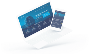
When Bluetext launched the Arlington Capital Partners-backed Centauri, we designed and developed a fully integrated content marketing program to establish the brand in the market and increase word-of-mouth around the launch, prioritizing recruitment and a strong web presence.

2. “We need to tell our story.”
We have moved on from verbose descriptions of who we are and what we do in a home page. Users do not want to read; they want to experience. Today, companies are using “digital storytell” to express their value proposition. Visually stimulating, thought-provoking, and often interactive, digital storytelling creates an experience for the user unique to your company that holds attention to get a message across. Top digital marketing agencies like to think of digital storytell like those chicken nuggets with a secret serving of vegetables inside. The consumer enjoys what they’re eating, but you’re giving them what they need at the same time.
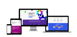
Take for example our work with Invictus. Invictus is a full-spectrum cyber technology and national security company dedicated to the protection of the nation’s security, global defense, and IT infrastructure. Invictus turned to Bluetext to embark on their next mission: grow from veteran-owned small business to big-time government contractor. With a fresh logo, reimagined corporate visual identity, and a modern website, Invictus is prepared to continue growth as a cyber-forward contractor for the federal government and commercial clients.
3. “We need to trim the fat.”
Less is more when it comes to content and choices. Users quickly get lost in antiquated sites with brochure-ware pages and deep menus. Content marketing agencies constantly hear from clients over how bloated their websites have become over time, and seek expert advice to tame its unruly junk drawers. A top digital marketing firm will tell you simplified information architecture can go a long way. Clear personas and usability testing can inform this crucial spout from which content strategy flows. Content should always be filtered for necessity, validated by the persona it serves, hole it fills, and value it adds. As attention spans wane, so must content.
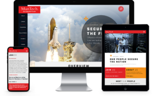
Bluetext partnered with ManTech, a multi-billion-dollar public company that provides subcontracted technological services to the US government, to develop a fully responsive site with an enhanced user-experience. The intuitive, well-organized design drives users to their needs quickly and functions as a lead-generation tool. The new site also provides a new experience to recruits with a seamless integration of job application workflow, allowing prospects to quickly search and filter jobs relevant to their specific interests and experience.

4. “We need to personalize the experience.”
Personalization is no longer reserved for B2C websites. The B2B sales cycle is long, often requiring many interactions and engagements over time. Repeat users are an opportunity to speak on a more personal level. The more data we capture about a user, where they come from, how and with what they interact, the more we can adjust a web experience. From imagery, messaging, journeys, iterative forms, and specific calls to action, personalization lets the user know you understand them. Personalization is not a ‘set it and forget it’ initiative. It requires technology, data, and iterative support over time, making it a daunting undertaking but one with a huge potential for return.
When we partnered with the Graduate Management Admission Council, we re-designed their microsite, CallingAllOptimists.com. Through collaborative field studies and research, Bluetext engineered a unique digital experience in the form of a personalized 4-question quiz. The quiz seamlessly guided the user to customized messaging and content based on their answers, while simultaneously gathering actionable user-insight which integrated directly to GMAC’s marketing automation platform. Not only did this redesign improve the campaign’s functionality and awareness – it created a holistic brand ecosystem that drove both the user and the client to their desired goal.
5. “We need to stand out.”
Ultimately, every brand wants to look cool. Every B2B company wants people to land on their site and think, “wow.” The very first thing a user takes in is the design. As a top digital design agency, we are constantly asked to be innovative and deliver a unique design unmatched by competitors. Bluetext often creates custom animations, illustrations, fonts, menus, forms, and imagery for clients. It’s critical that, while we can wander far from inside the box, we remain true to the brand. The balance of brand consistency and digital creativity can create the award-winning masterpiece many of our clients are after.
When Bluetext partnered with Varonis, we launched the eye-catching “Exposure” advertising campaign, targeting C-Level executives who are unaware of the potential risk they are placing on their enterprises by not leveraging solutions to understand who has access to the unstructured and human-generated data that their enterprise relies on.

6. “We need to cover our…selves.”
The legal landscape of the web is constantly changing. From data protection to inclusiveness, the C-Suite is recognizing the need for compliance to sleep easy at night. Beyond legal safety, these new requirements should be pursued because these rights aim to protect end-users. Digital marketers have a responsibility to make the internet a space for all users to experience equal comfort and access. From 508 to GDPR, your digital marketing agency should proactively implement these requirements as guided by your legal team.
Take for example our work with Level Access. When the SSB Bart Group, the leading provider of accessibility solutions and software, needed a new brand to increase its market share and continue on its growth trajectory, it chose Bluetext to deliver a new name, brand and website that would focus on its people and expertise. The new look and feel and how it is presented on the website reflects Level Access’ mission “to create a world where digital systems can be made readily accessible to users with disabilities—enabling digital technology to become a profound empowering force in their lives.”

7. “We need to harness the full potential of our website.”
Websites have become full-fledged marketing and sales tools. One piece of a 360-degree user experience, websites are now a living, breathing, asset, working in tandem with other channels. Data should consistently inform website governance decisions and data from the website should be analyzed to inform other channels inversely. From tracking to chatting, integrations that connect websites to other marketing channels can exponentially augment what we know about our users. Our clients constantly ask how we can integrate with full-funnel efforts, from hosting events online to chatting with prospects in other languages, the potential is near limitless.
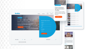
When Bluetext worked with ResMan, a property management platform, to invigorate their brand and redesign their website. ResMan charged Bluetext with repackaging their solutions into a strategic grouping that reflected the market’s needs. As a customer-centric brand, ResMan needed their external messaging and marketing efforts to reflect their goals as a company. Bluetext turned this request into a fully redesigned website, focusing on an enhanced UX that guides ResMan’s users through the site with an intuitive website flow.

All of these “needs” are important to consider, but it’s tough to nail them yourself unless you have unlimited time and budget. An experienced website design and UX agency, such as Bluetext, should guide you through these conversations when beginning a website project to determine what makes sense for your business’ goals and resources. At Bluetext, our goal is that one day a CMO will point to your website in a project kickoff as the bar for their “needs.”